Missouri State University

Skip to content Skip to navigation
a b c d e f g h i j k l m n o p q r s t u v w x y z

Brand Updates

Inspiration: Missouri State Career Center Facebook post

April 7, 2017 by Mary Chiles

In this series of posts we celebrate examples of creative and engaging branding within the university community. We highlight these to inspire you in your branding efforts!

Who caught our attention

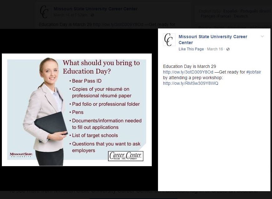
Missouri State Career Center’s Facebook post.

Why it captures the brand 

The Career Center uses several effective visual elements to convey its message.

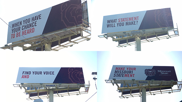
  • The Career Center used deconstructed frames, recommended under the branding guidelines. These convey a sense of motion, like turning a page or taking a step toward opportunities.
  • It uses the recommended primary brand color of maroon for a consistent, Missouri State-focused message.
  • It includes appropriate imagery with its use of statement photography. This is done to capture the pulse of the university. In this example students are preparing to use their degree to find a teaching job at the local, regional and national level.

How it meets the Career Center’s goals 

These brand elements help the Career Center demonstrate preparation for an education fair, which gives students the opportunity to find employment after graduation.

Filed Under: Inspiration Tagged With: brand, career center, facebook, Inspiration, shout out

Inspiration: Student Government Association’s post on Twitter

August 24, 2016 by Mary Chiles

Cabinet Member Chris Klenke

In this series of posts we discuss creative examples of branding within the university. We do this to inspire you in your own innovative branding efforts.

Who caught our attention

Student Government Association’s tweet highlighting Chief Commissioner of Sustainability Chris Klenke and the SGA Instagram account.

Visit our Instagram account & check out our awesome Chief Commissioner of Sustainability; Chris Klenke! @mostatesga pic.twitter.com/UkFYYDWtdG

— SGA (@MOStateSGA) August 16, 2016

Why it captures the brand

SGA incorporates recommendations for social media platforms.

Visual identity

SGA follows social media several guidelines for a clear, timely, effective message.

  • SGA uses key principles of effective social media posts. It is best to, of course, to post material appropriate for the audience; i.e., don’t post anything you wouldn’t want your mother to see. Organizations should still showcase personality, which SGA does, by promoting a member of the organization. It also incorporates photos, which helps posts stand out.
  • It follows brand recommendations for voice. The tone of the message conveys an organization whose members are earnest, inspiring, and direct.
  • It follows Twitter guidelines by giving its audience relevant information in a timely fashion. SGA had just updated its Instagram account and provided an update on its Twitter.  This is also mobile-friendly content, which is generally helpful since most people access Twitter on mobile devices. Users also often access Instagram on the same device.
  • It provides an actionable step and increases brand awareness. The audience spends time on one platform, then visits a second one. This increases visibility and opportunities for engagement.
  • It uses Trade Gothic font, which is recommended for bold, short messages.

How it meets SGA’s goals

SGA highlights individual members of the organization, which helps provide a face for the organization. It also demonstrates its sustainability component.

Filed Under: News and updates Tagged With: brand, Inspiration, sga, shout out

Inspiration: Missouri State Foundation’s ad in Tent Theatre brochure

August 17, 2016 by Mary Chiles

In this series of posts we celebrate examples of creative and engaging branding in the university community. We highlight these to inspire you in your branding.

Who caught our attention

Missouri State University Foundation’s ad in the Tent Theatre brochure.

Tent Theatre Foundation Ad_394x588

Why it captures the brand

The Foundation uses several effective visual elements to convey its message.

Visual identity

  • The Foundation demonstrates effective use of environmental photography, which is used to communicate vitality of life on campus. This photo of students dancing draws viewers to the scene by helping them to imagine hearing the music and laughter on stage.
  • It also uses statement photography, which demonstrates scenes of students actively learning. In this case, students showcase skills in acting and dancing. We also see examples of skills acquired in costume, makeup, stage production, lighting, choreography and directing. This combines for a well-rounded presentation of the Tent Theatre program and helps the viewer appreciate its impact on student performers and the audience.
  • It uses deconstructed frames, another recommended element of the branding initiative. This helps convey motion and energy and brings to mind a ticket for an event. These elements combine to invite the viewer to join the scene.
  • It uses the three recommended primary colors of maroon, black and white. They include the tertiary pop accent of “Tent Theatre orange” to make the wording stand out amidst a scene of celebration.
  • It uses Trade Gothic and Calibre font to communicate a clear, modern message.

How it meets the Foundation’s goals

Using these brand elements helps the Foundation illustrate actors showing enthusiasm and gratitude in a performance, which conveys appreciation for financial support.

Filed Under: News and updates Tagged With: brand, foundation, Inspiration, shout out, tent theatre

Inspiration: series of four billboards

August 8, 2016 by Mary Chiles

Make your Missouri Statement billboard

In this series of posts we focus on effective uses of our branding strategy. We offer these examples to inspire you in your own branding efforts.

Who caught our attention

Marketing and Communications created new billboards across Missouri to tell a story. These four are located along I-70 eastbound near Warrenton.

4billboards

Why it captures the brand

These new billboards replaced those that were completed in 2012. Although those were well received, they were updated in response to requests from the university community. This reflects a willingness to engage with various Missouri State audiences.

Creative platform

These four phrases emphasize the creative platform of the brand.

  1. When you have your chance to be heard.
    This communicates that you, as a representative of the university, will have an opportunity to speak up at some point. This prepares the viewer to consider herself in context of wider community of Missouri State.
  2. What statement will you make?
    Now that you are aware of the broader context, what will you say? How has university prepared you for global conversation?
  3. Find your voice and –
    decide what you believe, but be willing to listen to new ideas and change your mind.
  4. Make Your Missouri Statement.
    Considering your experience and growth at the university, decide how state your ideas and listen, integrating your experience with that of others.

Visual identity

  • They include the design element of Make Your Missouri Statement, which is an influential way to emphasize the university brand.
  • This element must be coupled with the Missouri State wordmark, that is, the university’s name written in a specific font, which it does.
  • In addition, the Bear Head can be used with the wordmark, so this billboard presents a powerful series of images that consistently use proper design elements.
  • It includes correct primary brand colors: maroon, black and white. These should be used in all communications. It also includes the secondary color of brick city red to to entice the viewer, then uses maroon to emphasize Missouri State.

Space limitations meant the message had to be concise, so Marketing and Communications used these statements. This is based on the recommendations that the the Make Your Missouri mark be used when the audience is already aware of the Missouri State brand. This is effective in this scenario due to placement of the billboards all over the state.

How it meets Missouri State’s goals

Marketing and Communications used the new branding phrase to connect with travelers who are familiar with the university. Following the creative platform guidelines provides an opportunity to encourage the audience to consider the university’s impact on them.

Filed Under: Inspiration Tagged With: billboard, communications, Inspiration, marketing, shout out, statement

Inspiration: The Missouri State Family Association’s welcome banner

July 28, 2016 by Mary Chiles

Missouri State Family Association banner

In this series of posts we call attention to effective uses of our branding strategy. We offer these brief points to inspire you in your own branding efforts.

Who caught our attention

The Missouri State Family Association‘s welcome banner.

Great 1st day of @MSUsoar Session 11! On to Day 2 and the Family Lounge! Our guest is @brianna_duda! #BearUp pic.twitter.com/mTMxedloAQ

— MSU Family Assoc. (@BearsFamilies) July 14, 2016

Why it captures the brand

The Family Association incorporates recommended branding elements for a consistent message.

Visual Identity

The Family Association uses several effective visual elements.

  • It displays the banner with grounding bars. These capture the viewers eye because they offer a “grounding” point for compositional grids containing three maroon bars.
  • It uses deconstructed frames, which are used to “bend” the enclosure of the frame. This provides a dynamic image that invites the viewer to connect with the message. Because of this the phrase “family lounge” now inspires images of opening a book, turning a page, receiving a ticket, or possessing a pass. It invokes closeness for viewers to connect with the school, and optimism for the student’s future at the university.
  • It uses a sans serif font called Brandon Grotesque, which is recommended for external communication with different audiences. The text font also follows recommendations that enable both scripts to complement each other. 
  • It includes all three of our primary branding colors: maroon, white, and black. It uses Carrington as a neutral font to offset the primary colors without getting lost against the white background.

How it meets the Association’s goals

This cohesive use of brand elements helps the Association connect with its targeted audience of family members of incoming students.

Filed Under: Inspiration Tagged With: banner, Inspiration, missouri state family association, shout out

Subscribe via Email

Enter your email address to subscribe to this blog and receive notifications of new posts by email.

Categories

  • awards
  • downloads and resources
  • Inspiration
  • News and updates
  • Portfolio
  • Social Media Kit
  • templates
  • Training

Tags

Alumni Association associated press beargrads BearsHomecoming brand brochure cnas commencement communications employees facebook faculty Football free photo days free portrait days graduate assistantships headshot Homecoming Inspiration instagram international programs loyalty card marketing MSUBears News and updates photo print professional profile publication recruitment Redesign shoutout shout out social media Social Media Kit staff style guide Training twitter university communications visual media web and new media web strategy and development writing

Meta

  • Log in
  • Entries feed
  • Comments feed
  • WordPress.org
Make your Missouri statementMake your Missouri statement
  • Last Modified: September 2, 2016
  • Accessibility
  • Disclaimer
  • Disclosures
  • EO/AA/M/F/Veterans/Disability/Sexual Orientation/Gender Identity
  • © 2013 Board of Governors, Missouri State University
  • Contact Information