As the Coordinator of Web and Emerging Technology for the Admissions Office, my job is to use web technologies to assist in the recruitment of future students. I was recently tasked with making one of our online forms “mobile-friendly.” I’ll share how I used responsive web design techniques to develop a few web pages that automatically change their layout and presentation when viewed on mobile devices.
A little background
One of the most valuable recruitment tools we use in Admissions is our campus visit program. A positive campus visit experience has the potential to greatly influence a student’s decision to apply and enroll at the university. To monitor how well our campus visit program works and to discover possible areas for improvement, we solicit and collect guest feedback through an online Campus Visit Evaluation form. Our challenge is getting more visitors to complete this evaluation form — the more feedback we collect, the better we understand our visitors and how to positively influence them. So…how do we get more feedback?
The big idea

We recently put into practice a new idea for increasing visitor feedback. We now encourage our campus visitors to complete the evaluation form using their smartphones at the end of their tour, while the experience is still fresh in their minds. Our campus tour guides provide a printed QR code which guests can easily scan and be taken to the online Campus Visit Evaluation form.
Make it mobile-friendly
The idea is simple — if you make a task more convenient, there’s a greater likelihood it’ll get done. To make our campus visit evaluation process even more user-friendly, I was asked to develop a mobile-friendly version of both the online evaluation form and the “Thank you” page that returns when an evaluation form is submitted.
I was eager to tackle the task, as it would give me real-world experience with one of the hottest topics currently in web design and development, something called “responsive web design.”
What is responsive web design?
Responsive web design, sometimes referred to as “adaptive web design,” involves the development of web pages that dynamically adapt to best suit the user’s browsing environment (e.g., mobile phone, tablet, laptop, or large desktop monitor).
The easiest way to explain responsive web design is to show some examples. The first image below shows the original Campus Visit Evaluation form page and how it adapts when viewed on a mobile phone. The second image shows how the form submission confirmation web page — the “thank you” page — also responds when viewed on a mobile phone.
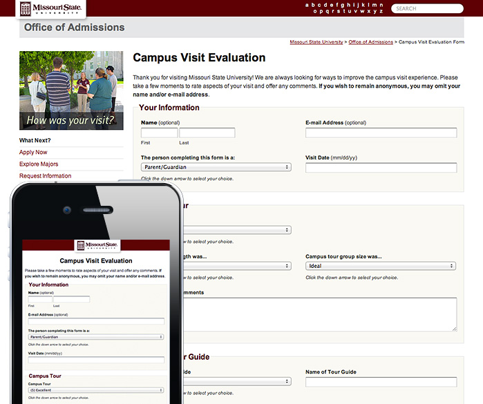
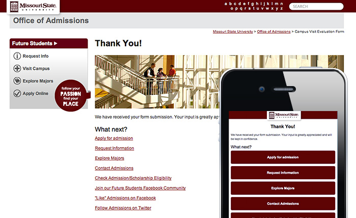
You can experience for yourself the dynamic change in the page layout by going to the Campus Visit Evaluation form page and the form submission confirmation page. Simply decrease the width of your browser window by dragging the right edge of the window inward towards the left, until the width is as narrow as a common mobile phone (480 pixels).
Back to task
To start the process of making these pages mobile-friendly, I needed to decide what types of changes would make the pages easier to view and interact with on a small-screen mobile device. Here’s what I came up with:
- Simplify the two-column page layout to one column
- Convert the fixed-width page layout to a full-width, fluid layout
- Selectively remove or hide non-essential page elements
- Decrease font size of headings
- Center-align logo and headings for symmetry with centered full-width layout
- Convert the “What next” text links on the form submission confirmation page to larger and easier to push buttons
These changes are fairly easy to make with CSS. But how would I selectively serve only the new, mobile-friendly CSS rules to mobile devices while keeping the original CSS intact for traditional, larger screen browsers?
Enter the mighty CSS media query
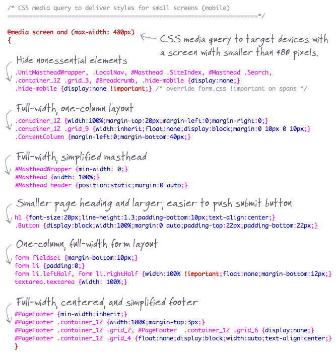
The hallmark technology powering responsive page layouts is the CSS media query. CSS3 media queries make it possible to target browsers based on media characteristics such as screen size and display orientation. Unique CSS rules are then served to browsers that fit the parameters of the media query. I like to think of media queries as conditional logic for CSS or CSS if–then statements.
For example, the code below targets only devices with a maximum screen width of 480 pixels (e.g., iPhone), and then serves specific styles only to those devices.

One of the biggest benefits of media queries is that they allow us to address the needs of many screen sizes (mobile phones, tablets, desktops, widescreen monitors), all with one code base. This means we don’t have to develop or maintain additional web pages to support different devices.
Below are the CSS rules used to adapt the Campus Visit Evaluation form page for mobile devices.
A few gotchas
No support for media queries in IE 8 and older versions
Internet Explorer 8 or older versions don’t support CSS media queries. One of the easiest ways to enable support for these browsers is to add the following code inside the <head> section of your HTML page. Read more about this JavaScript file.

iPhone rescaling
By default, the Apple iPhone and iPhone Touch rescale web pages to proportionately fit their small screens. This is good for pages that have not been optimized for mobile viewing. But if you’ve optimized your pages for display on these devices, this behavior is unwelcome, as it unnecessarily scales your page down and shrinks text and other elements.
To override this default behavior, add the following code inside the <head> section of your HTML page.
Are we there yet?
After brainstorming the design changes necessary to make the pages easier to view on a small screen, creating the CSS rules to implement the changes, forming the media query to target devices with a screen size less than 480 pixels, addressing some common problems with browser support and iPhone rescaling, and testing, I was basically finished. To be clear, this project was a pretty limited journey into responsive web design — I didn’t have to work with complex page layouts or essential images and I didn’t have to create layouts, media queries and CSS rules for devices other than a small-screen mobile device. As the interest in mobile-friendly web pages increases, I’m sure I’ll have the opportunity to dive into more complex projects requiring support for tablet-size screens and other devices.
Further resources
Responsive web design is a popular topic and there’s certainly no shortage of detailed guides and tutorials available. I’ve barely scratched the surface with this simple look into my experience. Here are links to resources that I have found particularly helpful.
Responsive Web Design — the blog post that ignited the community
Responsive Web Design: What It Is and How To Use It
How To Use CSS3 Media Queries To Create a Mobile Version of Your Website
Responsive Illustration: a fun and interactive tool for viewing how different screen widths trigger responsive layouts
Best in show
The following websites are outstanding examples of responsive web design. To see how the pages adapt, simply reduce the width of your browser window.
http://www.alistapart.com/d/responsive-web-design/ex/ex-site-FINAL.html
- Responsive web design for mobile-friendly pages - January 9, 2012