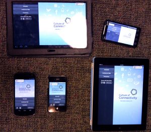
We made brief foray into the world of mobile applications a few years ago. Since then, we’ve been busy concentrating on upgrading our site design and infrastructure. However we have been wanting to return to producing mobile versions of high-level sites. Rather than tackle of of the big questions we have about our homepage, we decided to start on a much more limited scope: the 2012 Public Affairs Conference.
Conference apps provide a clear user experience and have a decidedly small set of tasks that everyone attending does in some fashion. After using several different apps while attending our own conferences, we were able to select the experience that was the best fit for our conference. And while the list of features wanted in the app was overwhelming, we decided to keep it simple and concentrate on the three main ones:
- The schedule
- Presenter bios
- Facility map
With the list of mobile devices and tablets growing by the day, we decided to stick with the original strategy and produce an HTML5 site with a native code wrapper. The good news is the situation has vastly improved for this technique.

Strategies that worked
- The entire app as a single HTML page
I wanted to avoid the “page-loading” experience when a user selected an option. I also wanted to be able to add transitions between sections. To do this, I dynamically generated the content from javascript. - Navigation by Anchor
Rather than tying event handlers to content and then having to worry about removing them when they left the page, I used standard HTML anchor elements linking to anchors that didn’t actually exist. In my javascript I had a single hashchange event listener on the window which allowed me to handle all navigation. In fact, there wasn’t a single event listener attached to page content! - Cache-manifests, Offline access and local storage
Finally these HTML5 features are well supported by both iOS and Android devices and I was able to make heavy use of them. Learning the trick that the cache-manifest file itself should set headers to prevent being cached improved this feature. There are still plenty of bugs with it though. Local storage was used to cache the database content. Requests to refresh were made once an hour (if the user was online). - Inline stylesheets and javascript
The app was a single page so it didn’t make much sense to request a separate stylesheet or javascript. All of the styles were in the document head and the script was the last thing before the closing body tag.
Strategies that didn’t
- Using overflow:auto or overflow:scroll
Turns out that anything other than overflow:hidden or overflow:visible is only supported in iOS 5 and Android 3+. Unfortunately even then both of them had quirks with it. Halfway through development my entire site layout had to be thrown out and re-coded using position:fixed elements instead. - Touch gestures over scrollable content
Mobile browsers can intercept and handle Touch gestures, however doing so prevents the browser itself from getting the event. So when is the gesture a swipe vs. when is it a page scroll event? For future apps I’ll try capturing touch events on the native app wrapper and trigger Javascript page handlers. As a workaround I rendered the swipeable area as a very wide page and caused scroll events to “snap” to predefined boundaries. Messy, but I got several comments on how nice and smooth the result was. - Auto-updating content with new cache-manifest versions
Turns out, an app stays alive on a mobile device a LOT longer than I anticipated. I figured that with normal usage an application would be killed and restarted automatically at least once a day (from low-memory triggers caused by other apps). Not so much. The next version will force a check for a new application cache version at the same time it syncs database content to local storage.
Tools used
I made heavy use of the Google Closure-tools (library, templates and the compiler). They are all designed to work well together and the dead code removal of the compiler allowed me to use many features of the library without increasing my final size with unused code.
Workflow
The features of the app were discussed with our designer, Lindsay Thomack, as well as finding apps that did similar things. Lindsay then built the design taking into account different size devices as well as handling landscape vs. portrait view. I then implemented the app and posted it.
- Modern Campus Calendar Details - April 2, 2024
- Calendar updates: Training available - March 20, 2024
- Updates: New Modern Campus Calendar - March 7, 2024
- Preview MSU’s new calendar system - January 22, 2024
- Recap: Hello Omni CMS, goodbye Web Press! - March 14, 2023
- Improve your Omni CMS skills at this free training - February 21, 2023
- Celebrate Global Accessibility Awareness Day (GAAD) on May 19 - May 16, 2022
- New Content Management System Coming Soon - March 3, 2021
- Meet our newest team member: Valerie Cummings - October 20, 2020
- Graduate students: Share the stories of MSU - May 1, 2019
