Missouri State University

Skip to content Skip to navigation
a b c d e f g h i j k l m n o p q r s t u v w x y z

Web Strategy and Development Blog

  • Web Strategy and Development
  • Web Support
  • @msuweb

Search Results for: accessibility

Celebrate Global Accessibility Awareness Day (GAAD) on May 19

May 16, 2022 by Web Strategy and Development

Missouri State students in computer lab.

The world celebrates digital access and inclusion with Global Accessibility Awareness Day (GAAD) on the third Thursday of May every year. More than one billion people worldwide have disabilities and impairments. GAAD gets people talking, thinking and learning about digital access and inclusion.

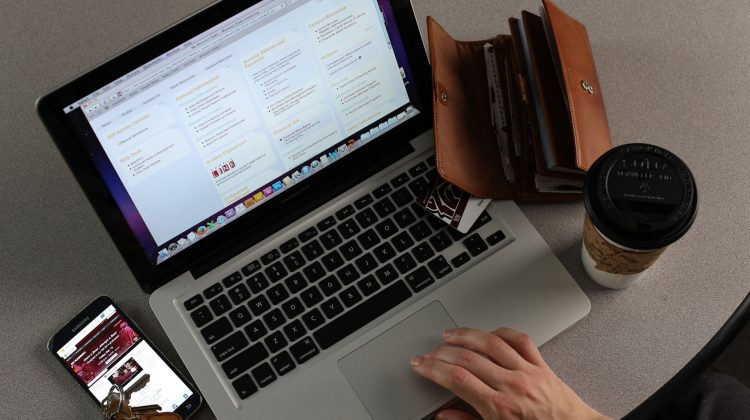
Creating accessible digital content is a must at Missouri State University. We know it can be a lot to think about, so here are some tips to keep in mind. We’ve also included some ways to join in virtually.

Find a GAAD virtual event

#SpotlightAccessibility – Spread positivity around accessibility by highlighting a great feature or product and learn about what others are using.

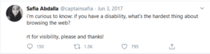
People with disabilities say these issues come up most often.

  • Videos that are missing captions.
  • Motion, animations and cluttered pages.
  • Auto play videos and auto-advancing slideshows.
  • Walls of text (long paragraphs and large chunks of text).
  • Small font size
    • Web Content Accessibility Guidelines (WCAG) does not specify a minimum font size requirement.
  • Zooming problems: sites frequently break when size is increased by user.
  • Low contrasts and image of text: scan of a page of text saved as PDF produces an image of text.
  • Bright color schemes: white backgrounds can lead to migraines.
  • Relying only on color: this has long been a no-no, but still prevalent.
  • Mouse-focused sites: not usable on touch screens and difficult for users with motor impairments.
  • Too small touch-targets: thhis is the reason Missouri State University’s 2019 web redesign is so spacious.
  • CAPTCHAS: Keep out a lot more than bots.

Here’s what you can do to make your content more accessible.

While some of these items are automatically handled by MSU’s web templates, you still have an impact on many of of these items.

  • Don’t create a wall of text. Keep paragraphs to 2-4 sentences.
    • Content styled as Intro format should be brief; one or two short sentences plus 1-3 bullets. Anything longer isn’t introductory content.
  • Use headings to make an outline of your content.
  • Avoid images of text. When necessary, the alt text should contain all text in the image.
  • Don’t use heading markup (e.g., h3, h4) to make an “important” statement; consider a Notice Block instead.
  • Don’t use bold or italics for an entire sentence.
  • Use meaningful text for links; avoid brief abstract terms like read more or click here.
  • For web addresses, write descriptive link text.

Make sure you’re following the style guide.

  • In time references, use figures with a.m. and p.m throughout. Omit :00.
    • Examples: Summer office hours are 9 a.m. to 4:30 p.m. Telephone support is available 2:30-4 p.m. daily.
  • In email addresses, capitalize each word. Example: BoomerBear@MissouriState.edu.
  • Preferred capitalizations, spelling and usage:
    • Phone numbers: use dashes, not periods. Omit parentheses around the area code. 417-836-5000
    • Most words beginning with “non” or “post” should be formatted as one word with no hyphen (ex. noncredit, nondegree, nondegree-seeking, postbaccalaureate, postdoctoral, postdoctorate). Post-master’s should be hyphenated.
    • Email, not e-mail.
    • Use only one space between sentences. Do not use a space at the end of a paragraph or bulleted list item.
  • Common Bear terms:
    • Bear CLAW
    • Bear Line
    • BearWear
    • BearFare
    • BearMail
    • BearPass
    • Bear Park North (South)
    • BoomerMeals
    • Bear Breaks

Resources

Editorial Style Guide

Web Accessibility Clinic

Omni CMS Documentation

Filed Under: Accessibility, Training Tagged With: a11ysummit, Accessibility, conference, gaad

Recap: Accessibility according to actual people with disabilities

August 27, 2021 by Brian Heaton

This information is from a blog post that summarizes responses to a 2017 tweet by Safia Abdalla:

Tweet by Safia Abdalla @captainsafia.

Review the full post by Hampus Sethfors: Accessibility according to actual people with disabilities.

Biggest issues identified

  • Lack of captions
    • Primarily for video.
  • Motion, animations and cluttered pages
    • Includes auto play videos and auto-advancing slideshows.
  • Wall of text
    • Long paragraphs and large chunks of text.
  • Small font size
    • Web Content Accessibility Guidelines (WCAG) does not specify a minimum font size requirement.
  • Zooming problems
    • Sites frequently break when size is increased by user.
  • Low contrasts and image of text
    • Scan of a page of text saved as PDF produces an image of text.
  • Bright color schemes
    • White background; can lead to migraines.
  • Relying only on color
    • Long been a no-no, but still prevalent.
  • Mouse-focused sites
    • Not usable on touch screens; difficult for users with motor impairments.
  • Too small touch-targets
    • This is the reason Missouri State University’s 2019 web redesign is so spacious.
  • CAPTCHAS
    • Keep out a lot more than bots.

What you can do

While some of these items are automatically handled by MSU’s 2019 web templates, you still have an impact on many of of these items.

  • Don’t create a wall of text. Keep paragraphs to 2-4 sentences.
    • Content styled as Intro format should be brief; one or two short sentences plus 1-3 bullets. Anything longer isn’t introductory content.
  • Use headings to make an outline of your content.
  • Avoid images of text. When necessary, the alt text should contain all text in the image.
  • Don’t use heading markup (e.g., h3, h4) to make an “important” statement; consider a Notice Block instead.
  • Don’t use bold or italics for an entire sentence.
  • Use meaningful text for links; avoid brief abstract terms like read more or click here.
  • For web addresses, write descriptive link text.

Make sure you’re following the style guide.

  • In time references, use figures with a.m. and p.m throughout. Omit :00.
    • Examples: Summer office hours are 9 a.m. to 4:30 p.m. Telephone support is available 2:30-4 p.m. daily.
  • In email addresses, capitalize each word. Example: BoomerBear@MissouriState.edu.
  • Preferred capitalizations, spelling and usage:
    • Phone numbers: use dashes, not periods. Omit parentheses around the area code. 417-836-5000
    • Most words beginning with “non” or “post” should be formatted as one word with no hyphen (ex. noncredit, nondegree, nondegree-seeking, postbaccalaureate, postdoctoral, postdoctorate). Post-master’s should be hyphenated.
    • Email, not e-mail.
    • Use only one space between sentences. Do not use a space at the end of a paragraph or bulleted list item.
  • Common Bear terms:
    • Bear CLAW
    • Bear Line
    • BearWear
    • BearFare
    • BearMail
    • BearPass
    • Bear Park North (South)
    • BoomerMeals
    • Bear Breaks

Resources

Editorial Style Guide

Web Accessibility Clinic

Web Press Documentation

Filed Under: Accessibility, Training Tagged With: a11ysummit, Accessibility, conference

Web Accessibility Clinic

May 21, 2020 by Brian Heaton

Students on computers in library

What’s the best way to announce new office hours?

How much italics should I use?

Is it OK to just say, “click here”?

While updating your office/department website over the past two months, you may have had questions like these.

This year’s virtual Web Accessibility Clinic, partnering with Global Accessibility Awareness Day, will provide answers.

Points of emphasis

Use the notice block when appropriate, but don’t go overboard.

Use bold and italics lightly.

Make sure you’re following the style guide.

  • Regularly check time-sensitive notices on your website to be sure they’re current, particularly those referencing office closures.
  • Consider using a Notice block for short-term, brief, important information.
  • Don’t bold or italicize an entire sentence. Treat just the important word(s).
  • Link text, by itself, should provide the user with an idea of the destination. Click here, More info and Read more should be avoided.
    • Examples of links that may be unclear if read out of context of the surrounding content:
      • Click here to see program requirements.
      • More info about web accessibility.
      • Read more about building websites with Web Press.
    • Examples of links that are concise, descriptive and clear:
      • Program requirements
      • Learn about web accessibility
      • Building websites in Web Press
  • Select Editorial Style Guide entries include:
    • In time references, use figures with a.m. and p.m throughout. Omit :00.
      • Examples: Summer office hours are 9 a.m.-4:30 p.m. Telephone support is available 2:30-4 p.m. daily.
    • In email addresses, capitalize each word. Example: BoomerBear@MissouriState.edu.
    • Preferred capitalizations, spelling and usage:
      • Phone numbers: use dashes, not periods. Omit parentheses around the area code. 417-836-5000
      • Most words beginning with “non” or “post” should be formatted as one word with no hyphen (ex. noncredit, nondegree, nondegree-seeking, postbaccalaureate, postdoctoral, postdoctorate). Post-master’s should be hyphenated.
      • Email, not e-mail.
      • Use only one space between sentences. Do not use a space at the end of a paragraph or bulleted list item.
    • For web addresses, write descriptive link text.
    • Common Bear terms:
      • Bear CLAW
      • Bear Line
      • BearWear
      • BearFare
      • BearMail
      • BearPass
      • Bear Park North (South)
      • BoomerMeals
      • Bear Breaks

Content editing best practices

Headings make your content easier to read. Use them.

Alt text helps everyone understand the meaning behind your non-text content (images, infographics, etc.). Not everyone can see, or will want to see, your photo(s).

Link text, or descriptive links, helps the user know where a link goes.

Headings

  • Headings are an outline of your content and should make sense out of context.
  • Headings divide your content into consumable sections.
  • Do not select heading level based on resulting visual presentation style.
  • Page title is heading level 1 (h1); first heading in your content will be h2; subtopic will be h3; etc.
  • Do not use bold paragraph for heading.
  • Avoid centering headings.

Alternative text for non-text content

  • Provide alternate (alt) text for non-text content.
    • Images, including poster/flyer images (infographics).
    • Alt text should convey in text whatever meaning is conveyed by the image/flyer.
      • If the image has a lot of information, charts, diagrams, etc., the alt text should contain 1) a short description conveying the essential information presented by the image, and 2) a long description following the image or on another page.
        Bar chart displaying cost comparisons as detailed in the following paragraphs.

Link text (descriptions)

  • Very critical to the page containing the link and the destination page.
  • Links should make sense out of context.
  • Do not use meaningless or incomplete text like click here, learn more, download, etc.
  • Do not use URLs for link text.
  • Optimal link text is typically 2-6 words.
  • Each unique destination should have unique link text.

Content structure

  • Use paragraphs, unordered and ordered lists appropriately.
  • Write for your target audience.
  • Do not use a heading or bold paragraph for announcement or notice. Use “Intro” or “Notice” markup instead.
  • Do not add blank paragraphs to generate separating space.
  • Do not create manual lists (e.g., starting lines with a hyphen).
  • Do not bold or italicize entire paragraphs, even one-line paragraphs. Treat just the important words.
  • Do not use all capital letters.
  • Avoid centering content.
  • The template is spacious by design to facilitate touch interfaces; do not try to circumvent vertical spacing.

Tables

  • Used for presenting organized data.
  • Never use for layout (e.g., two columns).
  • Should always have headers (th). No need to bold or specify header as a heading style.
  • Do not combine multiple tables into one with embedded description row preceding each table.
  • Precede with descriptive heading, paragraph or include a table caption.

Access previous accessibility presentations

  • Web Accessibility Clinic (Oct 2018)
  • Web Accessibility Summit (June 2018)

More assistance

  • Web help desk

Filed Under: Accessibility, Training, Web Press

Learn best practices for accessibility

April 11, 2019 by Brian Heaton

Web Accessibility Summit

Join us for the 2019 Web Accessibility Summit, a conference about all things website accessibility for professionals in higher education and beyond, hosted this year by Missouri State University.

Details

When: May 29, 8 a.m. to 5 p.m.
Where: Missouri State University, Glass Hall
Cost: $40

Workshops and track sessions will focus on how to make your web presence more accessible with technical and non-technical solutions. Networking opportunities will encourage sharing of information and resources with colleagues from around the state.

Missouri State faculty and staff should register through My Learning Connection. You may use your noncredit fee waiver to cover conference registration costs.

Non-MSU faculty and staff can register now.

Seating is limited so don’t delay.

Organizers

Several Missouri higher education institutions are organizing this event:

University of Missouri logo.
St. Louis Community College logo.
Missouri State University logo.
Missouri State University - West Plains logo.
Truman State University logo.
Missouri University of Science and Technology logo.
A.T. Still University logo.
University of Missouri-Kansas City logo.

Filed Under: Accessibility, News, Technical, Training, Web Press, web strategy and development Tagged With: a11ysummit, Accessibility, conference

Tune up your website on March 1 at the Web Accessibility Clinic

February 22, 2019 by Brian Heaton

Students on computers in library

When: 1 – 2 p.m. Friday, March 1, 2019
Where: Cheek Hall room 100

Brian Heaton and Kristeena Laroue will present a brief training session. Brian will cover the top five website accessibility issues. Kristeena will demonstrate access technology, so you can better understand how your website may be used.

After the session, you can grab a computer, discover accessibility issues and make corrections.

Free bonus

We will also give you some tips to make your website more search engine friendly, so your pages appear more frequently in search results.

Filed Under: Accessibility, Training, Web Press

Next Page »

Subscribe

Enter your email address to subscribe to this blog and receive notifications of new posts by email.

Follow @MSUWeb

My Tweets

Calendar

  • Complete Calendar

Categories

  • Accessibility
  • brand
  • email marketing
  • Mobile
  • News
  • Omni CMS
  • Redesign
    • Academic websites
    • Web redesign 2015
  • Social media
    • Social media kit
  • template
    • updates
  • Training
  • Video
  • Web Press
  • web strategy and development
    • Technical
  • Web Support
  • WordPress blogs

Meta

  • Log in
  • Entries feed
  • Comments feed
  • WordPress.org

Connect with web strategy and development

  • Twitter

Make your Missouri statementMake your Missouri statement
  • Last Modified: February 22, 2019
  • Accessibility
  • Disclaimer
  • Disclosures
  • EO/AA/M/F/Veterans/Disability/Sexual Orientation/Gender Identity
  • © 2013 Board of Governors, Missouri State University
  • Contact Information
 

Loading Comments...