Missouri State University

Skip to content Skip to navigation
a b c d e f g h i j k l m n o p q r s t u v w x y z

Web Strategy and Development Blog

  • Web Strategy and Development
  • Web Support
  • @msuweb

Accessibility series: alt text

April 3, 2017 by Mary Chiles

Example of WordPress screen for al text

Welcome to our series of posts entitled: how to make your website accessible! In the first post we discussed the ethical and legal reasoning for why accessibility is important.

Today we focus on adding alternative text to images.

Tips for success

It’s a good idea to add images to posts because it drives readers to your site. But how do we make the image work for everyone?

Imagine the pre-smart phone days. You’ve found an image from your days in Brownie Scouts and want to show your best friend. But she lives six hours away. You could make a copy of the photograph and mail it to her, but you can’t wait! So, you call her up on your landline and tell her about the photo. Similarly, alt text is like describing an image so that the website visitor can understand its meaning.

How much should you say? Here are specific ideas to consider while writing alternative text. Don’t begin the text with the words “an image” or “a photo.” Don’t repeat the caption because it is redundant. Do briefly describe the image.

When blogging

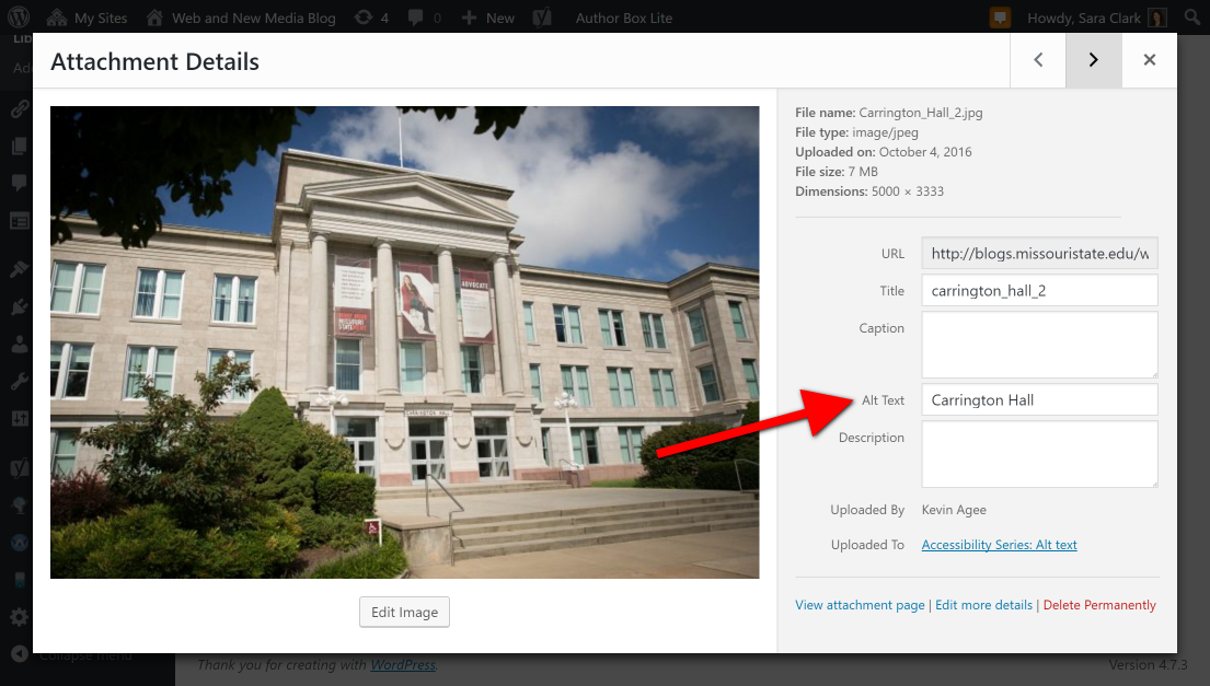
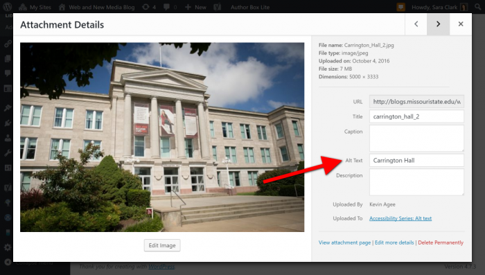
If you post to a Missouri State blog, you use the blogging platform WordPress.  This is how you add alt text within your Missouri State blog.

Screenshot of WordPress page for alt text
Use the Alt Text field when uploading or editing an image in WordPress.

When updating your website

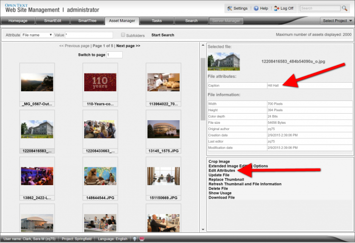
Missouri State webpages are maintained on Web Press. To add images to your site, upload it or select the image in the Asset Manager. You will have the option to add the caption. This is used as the alt text in Web Press.

Web Press screen showing alt text (caption)
Use the Edit Attributes link to add or change the alt text for an image.

How to know if you are successful?

To determine whether your site meets accessibility standards, enter the address into a web accessibility site like WAVE. Find the alt tag on images within the results. If it is green the alternative text is sufficient. If it is yellow it needs attention; it might be too long or too short. If it is red you need to add text.

Screenshot of students taking a photograph of themselves
After you enter your website address into WAVE, review the results for small red, yellow or green squares on each photo to check for acceptable alt text.

Filed Under: Accessibility, Web Press, WordPress blogs Tagged With: Accessibility, alt text, alternative, webpress, WordPress

Do your part for web accessibility

March 2, 2017 by

Computer lab

In January 2017, the federal government released the Information and Communications Technology Final Standards and Guidelines. This rule requires that Missouri State complies with the Web Content Accessibility Guidelines (WCAG) 2.0 Level AA.

Why do these standards matter?

As an institution that receives federal funding, we must comply with these federal regulations. But more importantly, developing accessible content is the right thing to do.

It is essential that the Web be accessible in order to provide equal access and equal opportunity to people with diverse abilities. Indeed, the UN Convention on the Rights of Persons with Disabilities recognizes access to information and communications technologies, including the web, as a basic human right.

Accessibility supports social inclusion for people with disabilities as well as others, such as older people, people in rural areas, and people in developing countries.

– W3C

Also, following these guidelines can improve the search engine optimization of your website. Many of the accessibility techniques overlap with SEO best practices, so your website will be better understood by search engines and possibly ranked higher in search results.

What does this mean for me as a website developer?

If you’re using Web Press, then many of the accessibility checkpoints will be handled by the overall templates. However, you need to ensure that the content you add to your website is also accessible. Below are some key areas that you should review:

Write meaningful text alternatives

Each image on your website much have a meaningful text equivalent:

  • Describe the image (like you would to someone over the phone).
  • Describe the destination if the image is a link.
  • Use a space if the image is decorative.

In Web Press, you supply the alt text when you upload an image to the Asset Manager.

Remember that context is everything, so sometimes the same image will have different alternative text. Read the WebAIM Alternative Text article for guidance.

This principle also applies to audio and video: you must caption your video and provide transcripts for audio.

Structure content with ordered headings and lists

Use true headings (not bold or other styling) within your conent to break up blocks of text. This provides a way for everyone to more easily scan your content and find what they need.

Additionally, use lists to break up the text on your website. Not only do they help structure the distinct items, but they also can help highlight important content.

Use the format drop-down box in the Rich Text editor to denote headings.

Write link text that makes sense out of context and describes the destination

When you add links to your website content, the name of the link is critical. Try to describe the destination of the link; a user should know where the link goes without having to read the surrounding content for context. Also, avoid using generic labels like “learn more” or “click here” as they lack specificity.

Mark the headers of data tables

First, only use tables for data (like you would use in a spreadsheet). Do not use tables to lay out content; Web Press offers columns for design options.

Second, when you have a data table, ensure there are marked header rows that describe each column/row of content.

Set the Cell Type to Header on your data table headers.

Use color wisely

Make sure the color contrast of your text and the background are high to maximize readability. The accessibility guidelines require a contrast ratio of at least 4.5:1 for more content. The only way to judge this is through a color contrast checker, where the two color values are compared.

Also don’t use color as the only way to convey information. Make sure the information is provided in another way, usually via text. The WebAim Color-blindness article provides some context and possible solutions.

What tools are available to assess website accessibilty?

There are many free tools that can help you improve the accessibility of your website:

  • Web Accessibility Evaluation Tool (WAVE)
  • Google Chrome Accessibility Developer Tools
  • Functional Accessibility Evaluator
  • Color Contrast Checker

Filed Under: Accessibility, Web Press Tagged With: a11y, Accessibility

« Previous Page

Categories

  • Accessibility
  • brand
  • email marketing
  • Mobile
  • News
  • Omni CMS
  • Redesign
    • Academic websites
    • Web redesign 2015
  • Social media
    • Social media kit
  • template
    • updates
  • Training
  • Video
  • Web Press
  • web strategy and development
    • Technical
  • Web Support
  • WordPress blogs

Meta

  • Log in
  • Entries feed
  • Comments feed
  • WordPress.org
 

Loading Comments...