Welcome to our series of posts entitled: how to make your website accessible! So far we have discussed the ethical and legal reasoning for why accessibility is important, and how to write alternative text.
Today we focus on color contrast.
Have you tried reading black letters on a red background? What about red letters on a maroon background? You might want to add some color to your website, but how do you ensure your site is still readable? The color contrast between the text and the background affects readability.
The contrast should be 4.5:1. This is the comparison between relative luminance of the first number compared with the second number. The good news it is easy to check. This color contrast site shows foreground and background color.
How to test
For foreground, click on the box for a color wheel and find the color of the font you are using. Click on the appropriate color to select it. It will show a small square in the color you picked.
Then, for background, repeat this step. It will also show a small square in the color you picked. You will see a color contrast ratio that automatically adjusts based on your color wheel selections. Make sure the ratio is 4.5:1 or greater.
Let’s return to the initial example. To pick colors, you will want to use the branding recommendations to ensure a consistent appearance.
First, let’s check black text against the Brick City Red background:
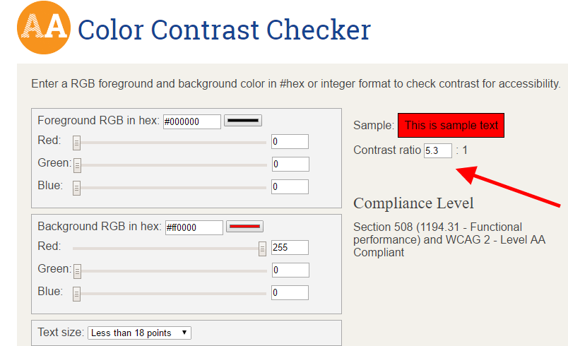
Perfect! The ratio is greater than 4.5:1, so this combination passes accessibility standards.
A word of warning: Some color combinations look like they “should” be readable, but are they? For example, take the Brick City Red text on Missouri State Maroon background. Let’s check.
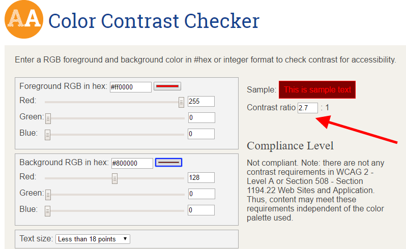
Nope! The color contrast ratio of 2.7:1 does not meet the accessibility standard of at least 4.5:1.