Missouri State University

Skip to content Skip to navigation
a b c d e f g h i j k l m n o p q r s t u v w x y z

Web Strategy and Development Blog

  • Web Strategy and Development
  • Web Support
  • @msuweb

Better search results now available

August 18, 2016 by

Search website screenshot

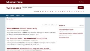
Today, we upgraded the university’s search to help you better find what you need. Search results are now powered by Google Custom Search, which is based on Google’s core search technology.

Search website screenshotGive it a whirl

Enter a term into the search box at the top of the Missouri State homepage.

Feel free to email your feedback to web@missouristate.edu — we promise to keep making tweaks to improve your results.

Special thanks

We appreciate the support from SGA and Staff Senate, and the additional funding from the university, to help make this project happen.

Filed Under: News Tagged With: Search

Going Mobile – Extending a Maps API Project to Smart Phones

December 7, 2009 by Web Strategy and Development

Campus MapThe Missouri State University Campus Map combines several different types of data into a single map site using the Google Maps API version 2. This past June, my office was approached by Jeffrey Thomas, a senior computer science student at the university, about software he had developed that uses BlackBerry phones as GPS devices. Jeffrey wanted to track in real time the location of buses in our campus transit system. As we looked at use cases, it didn’t take long for us to realize a large demand for such a service was going to be from the person standing at a bus stop with a mobile phone as opposed to the more traditional user on a laptop or desktop.

Version 3 API Issues

I began working on a proof of concept of such a site using the newly announced Google Maps API Version 3 but ended up having to postpone the project due to lack of features – especially polylines. After polylines were added, the first major snag I hit was lack of support for tile layers. So I wrote my own. I spent several days hammering out the code, followed by a substantial amount of time beyond that optimizing.

On our main map, we had been using invisible polygons to make our buildings clickable. I knew that strategy wasn’t going to perform well on a mobile device, so I changed to using an AJAX call that dynamically queried our database. The strategy worked so well we ended up implementing it on our main map as well. I’m even in the process of implementing the clickable tile layers that Pamela Fox described in her presentation at Google I/O on our main map.

Once these issues were handled, the major hurdles became less technical and more user-interface focused. I wasn’t happy with just having our bus routes and bus locations displayed on the map – I wanted a mobile map with the majority of the features offered on our main map.

Interacting on a Small Screen

Campus Map - Mobile VersionI struggled for a while with how to create an interface that maximized the actual map size but supported three different overlays (one with sub-options), geolocation and search. With feedback from coworkers, I ended up taking a cue from the default map application on the iPhone; I added a 44 pixel action bar to the bottom of the screen and used a combination of icons and text labels. Informal user testing has shown this approach to be effective as even people not familiar with either the iPhone or our campus have been able to effectively use the map.

Branding and the Fine Print

With screen real estate a precious commodity, I knew any type of header to the page was going to have to be small. Yet it was crucial to display our university logo and the page title. I settled on a thin band at the top. It was also a requirement to have some standard fine print on the page – typically reserved for the footer. I was not willing to shrink the map any more to accommodate such text. so I ended up developing an “about” button on my bottom toolbar which brought up an overlay with all of the required information.

Optimizing Everything

Once development was nearing completion, I moved to spending a considerable amount of time on improving performance. I took full advantage of the version 3 API support for marker icons using CSS sprites. I ended up also using CSS sprites for the action bar icons.

Fortunately, the Google Closure Compiler was just released. In order to use it for JavaScript minimization and optimization, I took the time to annotate my JavaScript (which was no small task).

The Allure of the Native App

Having our map site available in various app stores would provide exposure and better usability; however, I’m not willing to maintain additional versions of the map. That only really leaves me with the option of writing a shell application that simply embeds a browser (which may still happen). Now that the map has been optimized, the performance of the web application is very close to that of the native maps application on the iPhone.

Filed Under: web strategy and development Tagged With: app, design, feature, google, iphone, map, mobile, Search

Best of HighEdWeb 2009

October 19, 2009 by

HighEdWeb 2009 Conference

A few weeks ago, a group of Missouri State staff and faculty attended the HighEdWeb 2009 Conference in Milwaukee, WI. This conference is targeted at web developers in higher education. Last year, I sent out a summary of presentations, and several of you requested I send it again this year. Below are the favorites from 2009. Anyone can access the conference presentations and handouts.

Goal-Driven Web Strategy: Implementing Technology with an Eye on ROI

Favorite Chosen by Rob Hornberger, Enrollment Services

This session gave practical instructions on how to quantify results regarding whether or not integrating technology into a marketing plan has worked. We had real world exampled on how to calculate a return on investment, using examples such as an alumni broadcast email or an admissions visit event.

I learned calculations for how much of an employee’s salary was used on a project, how to access an online ROI calculator and determine how to populate the various fields, and why summer is an excellent time to engage admitted students for fall in a social network.

The Kids Are Alright

Favorite Chosen by Joe Hughes, Modern and Classical Languages

Mark Greenfield’s presentation addressed the elusive point at which technology and pedagogy intersect.

Tips: 1) Understand the Business, Understand the User, Understand the Medium; 2) Be Authentic

Augmented Reality – Merging the Virtual World into Ours

Favorite Chosen by Grayson Gordon, West Plains Computer Services and Chad Killingsworth, Web and New Media

This session demonstrated the Augmented Reality technology of which I was partially familiar and showed how applications can be developed for campus use. Combining 3d models into live video has all kinds of potential. This session demonstrated how easy it is to do and how it can be done with any computer with a web-cam.

Several marketing possibilities were demonstrated including a demonstration of TOPS Baseball cards. I saw how Augmented Reality could be used as a possibility for a Virtual Campus tour using commonly available open source applications.

BFF <3: How Social Networking Made the Class of 2013

Favorite Chosen by Brad Mitchell, Web and New Media

Ithica College used a third-party too, Social Engine, to create a private social network for incoming Freshmen and those interested in attending their institution. Social Engine was integrated with their Banner system. When a person changed from an applicant in their private social network to a student, their profile was ported over as a new student profile in Banner, and their information was carried over as well.

The most used tools within the social network were wall comments, personal profiles, and friending of others. The least used tools were private messages, photos, and the discussion forum.

Better Living Through Minions: A Guide to Student Workers

Favorite Chosen by Brad Mitchell, Web and New Media

Student workers are the most valuable resource to a web office. Students can see things, such as a page’s design, layout or content in a different way than we can. They are a great resource for testing a new web site.

Some great training tools for new student workers are:

  • Lynda.com
  • Opera Web Standards Curriculum
  • Cheat Sheets at addedbyes.com

Usability Workshop with Jared Spool

Favorite Chosen by Lindsay Winchester, Web and New Media

My favorite session of the High Ed Web Conference was the final workshop with Jared Spool. His focus on usability was specifically targeted at my role as a designer.

His workshop focused on the navigation style of sites. His method of navigation was aimed at pulling viewer toward their desired content versus pushing them in a direction we as content generators think they should go. His main idea was that website viewers will come to your site with a purpose in mind. They have a specific piece of information they want or a task to do. If a site’s navigation focuses on keywords that a viewer is likely to look for, your site is now leading them down a trail toward that information by “scent.” Viewers do not mind multiple clicks if they feel they are getting more specific information with each click, if they feel they are actually moving closer to there goal.

My main takeaways from this workshop is that navigation should be designed and structured to incorporate more keywords. From his research the ideal navigation is 7 to 10 words long for each choice. Anther main point I agreed with is assume the user has no knowledge of your institution. This is especially important for university sites to consider. One of a university’s website target audiences is prospective students. That translates into avoiding jargon terms as your navigation. The final take away for me was that from each page instead of structuring your navigation to reflect a hierarchical system, let the flow of information be more organic. The flow of information should be driven by the content itself. People structuring their pages should ask themselves, “What is the next piece of information the viewer would want?” There were many more interesting points from this workshop, but these were the highlights that particularly interested me.

Increasing Web Site Usability (With or Without a Redesign)

Favorite Chosen by Brian Heaton, Web and New Media

  • Users will only spend approximately 10-15 seconds scanning a page before moving on, and then will only “read” 20% of the text.
  • Eye tracking studies have led to the development of the F-pattern which is the prime real estate on your page. The implications of this are:
    • Most users don’t read text thoroughly
    • First two paragraphs = your most important information
    • Subheadings, paragraphs and bullets should start with information-carrying words
  • When writing for your web site remember:
    • Most people scan web pages—not read them
    • 50% text on the web as opposed to its print counterpart
    • Cut the “marketese” and the welcome mat
    • Don’t use clever spelling, like Fysics
    • Use terms your target audience(s) will be looking for while “scanning,” e.g., Master’s vs Graduate
    • Users expect underlined/colored text to be a hyperlink
    • Highlight (bold) key words, not entire sentences

Inform, Interact, Inspire: Reimagining the Admissions Website

Favorite Chosen by Brian Heaton, Web and New Media

  • Carleton College research indicates prospective students prefer home page photos of ornate buildings and campus settings and not people, which they suspected were staged shots of models. Carleton College called this a desire for a “sense of place.”
  • Research with prospective students passing through the admissions office demonstrated that prospects expected many of the same items available on (or directly accessible from) the university home page to also be on (or directly accessible from) the admissions home page. This lead to important lesson #1: to the prospective student, every page on your site is an admissions page.
  • There are two types of prospects, based on where they are in the admissions cycle. The first type of prospect, a searcher, is looking for something in particular, e.g., campus demographics or an application form. The second type, an explorer, is interested and now they want to learn something about you; they’re in search of that sense of place. They want to see the virtual tour, faculty and student profiles, blogs and campus/student videos.

Interactive Maps: Making Them Work for You

Favorite Chosen by Chad Killingsworth, Web and New Media

This session validated much of the work we have done over the past 2 years to the campus map. The session specifically talked about the importance of having all the maps use a common source, have a good search and a very clean interface.

Talking to Your Boss about Twitter

Favorite Chosen by Sara Clark, Web and New Media

Lori Packer provided a great summary for how to show all kinds of social media, including Twitter, to decision makers. First, show them the stats, second let them see the conversation then take them for a test drive. Some takeaways from her session included:

  • Social media is not about control. Social media is like a river: you can’t control the river, but you can harness it to further your goals.
  • It’s best to just get started first then generate a strategy.
  • Use Twitter to do your job better and look for opportunities.

Filed Under: Training, web strategy and development Tagged With: Admissions, app, blog, Blogs, content, counter, design, heweb09, HighEdWeb, instructions, lab, map, media, new, new media, pages, Redesign, Search, Social Media, students, Training, Twitter, usability, Video, Web

Re-purposing videos from Inside Missouri State

September 30, 2009 by

This post will give you step-by-step instructions on how to embed the videos from Inside Missouri State on your University web site. There are five marketing message videos, one for each of the first five sections of the site, as well as testimonial/spotlight videos that correspond to each marketing message on the left of these sections. You are free to include any of these videos on your University website. Here’s how:

  1. The videos are hosted on Missouri State’s iTunes U site. You will need the URLs for these videos to embed them on your site. First ensure that the iTunes software is installed on your computer, and then visit http://itunesu.missouristate.edu and click on the button labeled ‘Open iTunes U: Public Access.’ This will open iTunes on your computer, and automatically navigate to Missouri State on iTunes U.
  2. Now that iTunes is open to Missouri State’s page, click on the section labeled ‘About Missouri State,’ which is in the first content area called ‘Welcome.’ You will see multiple tabs in the About Missouri State section. The tab labeled ‘Inside Missouri State’ houses the five marketing message videos from Inside Missouri State, and the tab labeled ‘Spotlights’ houses the testimonial videos from Inside Missouri State (they are the first six videos under this tab).
  3. Find the video you wish to use on your site, ensuring that the correct tab where it is located is selected and open in iTunes. At the top of the page is a ‘Subscribe’ button. Right-click on this button, and select ‘Copy Link.’
  4. Open your web browser, and paste the link you just copied from iTunes into the address bar and press Enter. You will now see the RSS Feed of the tab you had open in iTunes U. Find the video you wish to embed on your site, and copy the URL of that video. The video URLs should all end with ‘encolusure.mp4.’

Now that you have the URL to the video copied, you need to paste that URL into the video player. In Web Press, you will use a content class called ‘Video Player – MP4 or FLV.’ The instructions below will show you how to embed the video using this player in Web Press.

If you have a University site that does not use Web Press, the embed code can be provided to you. Please send an email request to bradmitchell@missouristate.edu if you would like to use the video player embed code on your site outside of Web Press.

To embed the video in your Web Press page:

  1. Open the Foundation Page of the web site that you want to edit.
  2. Scroll to the bottom of the page, and click Edit List of Content Pages. The Edit Link Element page opens.
  3. On the Edit Link Element page, click Create and Connect Page. The Content Class Groups page opens.
  4. In the top portion of the screen, click the General Pages group.
  5. In the bottom portion of the screen, click Video Player – MP4 or FLV.
  6. Type in a headline. This headline can not seen by users and is used for searching only.
  7. Open Edit Video Settings Via Form and paste the video URL you copied from iTunes.

(More information on using the MP4/FLV Video Player in Web Press can be found at http://webpress.missouristate.edu/VideoPlayerMp4Flv.htm)

Also note that you can use the above instructions to embed any video that is hosted on Missouri State’s iTunes U site. Simply find the video you wish to embed on your site, and then follow the above instructions.

Filed Under: Technical, Video Tagged With: app, Apple, content, inside, instructions, iTunes U, lab, new media, pages, re-purpose, resources, rss, Search, Video, Web, Web Press

Missouri HighEdWeb Conference Recap

August 6, 2009 by

We recently attended Missouri’s regional HighEdWeb one-day conference. We had a great day and got lots of good information from our peers around the state. Here’s some of the information members of our office learned:

Brad:

  • When designing and implementing a new website, you have to manage expectations of others at your institution. It’s impossible to please everyone.
  • Hackers will often use university websites for cross site scripting, because people trust websites that end in .edu.
  • Audio and video is much easier to find via search engines if a transcription is included with the media.
  • You can use e-cards as gifts that people can give to one another on Facebook. The Gift Creator application is an easy way to brand your own gift-giving Facebook app and have students, alumni and fans use to share branded imagery from your university.

Sara:

  • You need to use several layers of protection on web applications to prevent cross site scripting:
    • Input filtering when possible
    • Input validation
    • Output encoding
    • Using an intrusion detection system, such as PHPIDS or .NETID
    • Tidying the output, such as with HTML Purifier

Brian:

  • Several markup strategies will improve your search ranking:
    • Use TITLE tags (Web Press: check)
    • Limit dynamically generated pages (check)
    • Use semantic markup (check)
    • Use META tags (check)
    • Keep presentation (CSS) and functionality (JS) external (check)
    • Microformat addresses (now planned)

Filed Under: Training Tagged With: app, audio, design, facebook, HighEdWeb, media, new, pages, Search, students, Video, Web, Web Press

Next Page »

Subscribe

Enter your email address to subscribe to this blog and receive notifications of new posts by email.

Follow @MSUWeb

My Tweets

Calendar

  • Complete Calendar

Categories

  • Accessibility
  • brand
  • email marketing
  • Mobile
  • News
  • Redesign
    • Academic websites
    • Web redesign 2010
    • Web redesign 2015
  • Social media
    • Social media kit
  • template
    • updates
  • Training
  • Video
  • Web Press
  • web strategy and development
    • Technical
  • Web Support
  • WordPress blogs

Meta

  • Log in
  • Entries feed
  • Comments feed
  • WordPress.org

Connect with web strategy and development

  • Twitter

Make your Missouri statementMake your Missouri statement
  • Last Modified: March 4, 2010
  • Accessibility
  • Disclaimer
  • Disclosures
  • EO/AA/M/F/Veterans/Disability/Sexual Orientation/Gender Identity
  • © 2013 Board of Governors, Missouri State University
  • Contact Information
 

Loading Comments...