With the proliferation of articles on scalable vector graphics (SVG) from the web community within recent years, you would think this image format is some bleeding edge web technology. However, SVGs were first developed by the World Wide Web Consortium (W3C) in 1999 and released as an official recommendation in 2001. So how can a web technology that is nearly eighteen years old be the hot topic in today’s web circles? To answer that question, let’s first look at what a SVG actually is.
What’s your vector, Victor?
SVG images are an XML-based vector image format. As opposed to raster, or pixel-based, images such as JPG, GIF and PNG formats, SVG images use coordinates and mathematical calculations to create resolution-independent lines and shapes. Simply put, SVG images are fully scalable without any loss of quality. And since SVGs are human-readable code, they can be edited and versioned as with any other piece of code, readily manipulated by standard web languages such as CSS and Javascript and compressed to extremely small sizes.
One format to rule them all?
So SVG is the One Ring of web graphics, right? Not quite. While SVG images have a litany of benefits, their wheelhouse is relatively flat graphics and shapes. Photographic images and overly complex illustrations will still perform better and more reliably as familiar raster formats such as JPG. However, that opens up a tremendous opportunity for SVGs to shine. The following examples showcase how SVG images outperform comparable raster graphics.
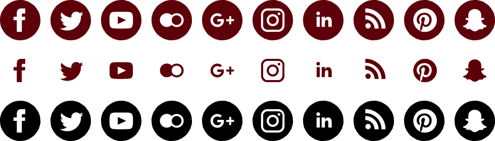
Icon sprites
Icon sprites are a common way to implement and deliver a large volume of user interface icons and graphics with fewer server requests, thus decreasing page load time. This is done by pre-compiling individual graphics into one large graphic “sheet” that can then be repositioned and cropped via CSS to show only the applicable icon. The down side to traditional icon sprites is that they are cumbersome to maintain and implement. With the advent of high-density displays, they can also quickly grow in file size as different resolutions are accommodated.
Filesize: 30kb (24-bit transparent PNG)
Similar to their raster counterparts, a SVG sprite combines multiple icons and graphics into one file. Unlike a PNG sprite, though, a SVG sprite has to only have one iteration of each icon or symbol since CSS can control the scale as needed. Styles can also be applied to create custom themes for icons. Do you need to change the default black icon to Missouri State maroon? Simply write a new style to target that class and it’s done. Additionally, new symbols can be added by simply cutting and pasting the new symbol code directly into the SVG sprite file. Gone are the days when you have to run countless individual graphics through a sprite generator and do frustrating CSS math to get them to display correctly. SVG sprites offer an impressive level of flexibility without compromising file size.
Filesize: 5kb uncompressed, 1kb compressed (gzip)
Hover styles have been set to show how the same icon set can be “themed” through the use of CSS.
Responsive and adaptive logos
Another challenge introduced with multiple resolutions and device widths is getting relatively detailed graphics such as logos to work at various breakpoints. A logo that is readable and properly scaled at desktop dimensions may become muddled once it is viewed on a phone. One solution has been to use CSS to swap out the graphic designed for desktop with one that is thoughtfully designed for mobile. Again, this creates multiple assets that have to be managed and extra load time to display higher-resolution graphics.
Similar to how specific symbols can be referenced in an SVG sprite, you can use several symbols to make up a larger graphic such as a logo and then utilize CSS to turn on or off these symbols at different breakpoints. For example, the Missouri State University logo that includes the Carrington icon and wordmark may look great on a desktop view, but become indiscernible at tablet scale. CSS and media queries can hide the icon and allow the wordmark to scale up to a more appropriate size. As we go down to phone scale even the wordmark may be too much, so we can show just the icon and hide the wordmark making better use of the space. All of this can be accomplished with one SVG logo and thoughtful use of CSS and media queries.
Charts and infographics
Charts and infographics add another level of visual interest to a site and can help communicate overly technical data. A beautifully illustrated infographic designed for print does not usually translate well to the web, though. The common fix is to slice up the infographic into a series of JPGs or PNGs. This rather heavy-handed approach requires lengthy alternative text or supplementary content to make this data accessible to visually impaired users and can negatively impact a page’s load time.
Remember how SVG images are simply XML documents? That means they can contain tagged text that is accessible to humans, assistive technologies and search engines. Additionally, it can be copied and pasted as well as printed at full resolution. Add to that the ability to be animated and styled by CSS and you have a robust and efficient way to present compelling data.
SVG infographics contain fully accessible content that can be readily selected for copying and pasting into other documents.
Back to the future
Now that we are chomping at the bit to fill our websites with SVGs, we pause and ask ourselves, “Why aren’t SVG images more prevalent?” Two words: Internet Explorer. The behemoth that is IE did not support the SVG standard until IE 9. That means up until 2011 a huge chunk of the browser market was unable to utilize even basic implementation of SVG images. But there are promising days ahead. Virtually everyone can now reliably view SVGs on the web in all major browsers and enjoy the many benefits they offer. Even better, the web development community is rallying behind the merits of SVG and educating about best practices and techniques that take a seemingly archaic and almost-forgotten web technology and catapult it into one of the most relevant ones of modern web design.
Case study
So where does this meet Missouri State University’s web development efforts? We are always looking for innovative and appropriate ways to accurately and efficiently deliver web content to all of our audiences. With some of our primary goals including mobile-friendly delivery and content that meets accessibility standards, SVG images have been on our radar for a while. And now that browser support is much broader, we are able to readily implement SVGs within our sites.
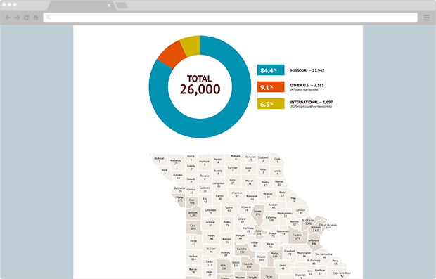
Our first effort was the recent update to the president’s legislative guide website. This site is a companion to a print piece that is delivered to Missouri legislator’s updating them on how Missouri State has met various goals over the previous year. The website is often referenced throughout the year from a variety of devices and by a variety of audiences and is laden with charts and graphs. This combination made the legislative guide website a perfect opportunity to implement SVG images.
Result
Being our first foray into SVGs, the preparation and optimization efforts took a bit longer than if we had used traditional PNGs. But the payoff was huge: we saved about 50 kb on the page titled “The Value Option” and another 170 kb on the about page with graphics looking crisp at any size.
Additionally, the data within each infographic is accessible to assistive technologies and can readily be copied and pasted by legislators and administrators for annual reporting and other documentation making it a more useful reference source.
Discover more from Web Strategy and Development News
Subscribe to get the latest posts sent to your email.