Welcome to our series of posts called, “How to make your website accessible.” We have discussed the ethical and legal reasoning behind accessibility, how to write alternative text, checking color contrast, how to write descriptive links and how to create accessible headings. The accessibility journey is moving onward with the discussion of using color to convey content.
Consider all readers
Color is a powerful visual means in the real and digital world. It conveys mood, adds presence and helps distinguish information. Color provides great design advantages, but when it is relied on to convey content – it can be ineffective.
The use of color to convey meaning creates problems for people with low vision, color perception deficiencies and color blindness. Users who have color deficiencies struggle to navigate their way through color-drenched content.
Don’t use color alone to convey meaning
As we have discussed previously, the purpose of screen readers is to read content aloud to users with visual impairments. It is important to know screen readers do not read aloud visual information. Therefore, the screen reader does not read color information.
Non-visual and visual users who cannot access color must be taken into account when using color to emphasize elements. Information conveyed with color must also be communicated textually to be effective.
The accessible solutions
Don’t be afraid to use color. However, don’t rely on color alone to convey content because it can be ineffective. The best way to design for users with visual impairments or lack access to color is to provide emphasis using text, identifiers, symbols or patterns.
Using text with color
When color is used to instruct a user to take an action, a textual alternative must be provided. For instance, “Select the green button to advance to the next chapter,” is not accessible because not every user can see the color green. Rather, the instructions should read, “Select the green Start button to advance to the next chapter.”
Below is an example of accessible buttons including color and text. Don’t forget to consider color contrast when adding text onto a colored button.
<button style="background-color: #4caf50; color: white; padding: 10px; border: none;">Start</button>
<button style=”background-color: #f44336; color: white; padding: 10px; border: none;”>Cancel</button>
Using identifiers with color
Required form fields are often identified using red text as a signpost. Screen readers will not identify which text is in red. Consequently, the user with visual impairments will not know which fields are required.
Rather than using just color to identify a required field, it is best to place an asterisk and advise users that “Required fields are red and marked with an asterisk.” A screen reader will read aloud the symbol, allowing the user with visual impairments to identify the required fields.
In Web Press, there is a “required field” option that will automatically place a red asterisk beside the required field.
Having “required” on an element lets the browser know this attribute exists and the corresponding input is a required field. When the required attribute is present, it specifies that an input field must be filled out before submitting a form. If a form is submitted with required fields incomplete, a message will appear to alert the user of the empty field. The image below shows the code behind the form above.
<dl class="ContentBlock Page247285">
<dt><label for="tb247285F" class="RequiredField">First name</label></dt>
<dd><input type="text" name="Field_First_name" placeholder="First name" size="30" required id="tb247285F" /></dd>
<dt><label for="tb247285M">Middle name</label></dt>
<dd><input type="text" name="Field_Middle_name" placeholder="Middle name" size="30" id="tb247285M" /></dd>
<dt><label for="tb247285L" class="RequiredField">Last name</label></dt>
<dd><input type="text" name="Field_Last_name" placeholder="Last name" size="30" required id="tb247285L" /></dd>
</dl>
Using patterns and textures with color
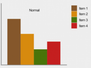
Let’s consider bar graphs. If a user can see color, the graph below is easy to understand because each bar is clearly identifiable and distinguishable.

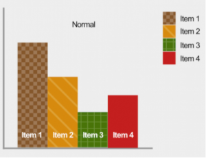
If color is removed, it is difficult to distinguish each bar on the graph. A solution would be to include a pattern or textual identifier, in addition to color, on each bar to make it distinguishable for all users. A correct example can see seen below:

Using shapes with color
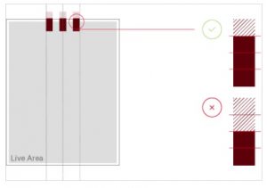
Use shapes in addition to color to indicate where problems arise. For example, brand.missouristate.edu uses color and shapes to identify the correct use of grounding bars. The color green and a check mark is used to identify the correct use of grounding bars. Conversely, the color red is used with an X to identify the incorrect use of grounding bars.
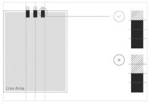
 As you can see below, if color is eliminated, a user will still be able to identify which option is correct or incorrect because of the symbol associated with it.

Color is your friend
Color should not be a design element that is avoided. Color is an element of visual communication that enhances design, identity and usability. Please think of color as a means to enhance and enliven the display of a page. When used as a supplement, rather than on its own, it can be a great benefit to all web users.
Ask the Web Help Desk
How can I check to see what my webpages look like without color?
Follow the steps below to apply a greyscale filter to your webpage:
- Go to the Colorblind Web Page Filter.
- Type the URL of your website into the Type a URL box.
- Select Greyscale/achromatopsia from the Pick a color filter drop-down menu.
- Select Fetch and Filter!
Where can I learn more about color vision deficiencies?
There are several types of color-blindness and visual deficiencies affecting color. You can use a Color Blindness Simulator or watch the video below to learn about each color vision deficiency.
Where can I learn more sufficient techniques to meet this accessibility guideline?
The Web Accessibility Initiative gives great advice, techniques and insight into this accessibility guideline.
Additional questions?
The Web Help Desk is on your team. If you have any questions or need further assistance, please contact the Web Developer Help Desk at WebPress@MissouriState.edu or call 417-836-5271 between the hours of 1 p.m. and 5 p.m. on normal business days.

