Missouri State University

Skip to content Skip to navigation
a b c d e f g h i j k l m n o p q r s t u v w x y z

Web Strategy and Development Blog

  • Web Strategy and Development
  • Web Support
  • @msuweb

Accessibility series: Video captioning

April 5, 2018 by Alyson Epperson

screenshot of onward, upward video from YouTube

Welcome to our series of posts called, “How to make your website accessible.” We have discussed the ethical and legal reasoning behind accessibility, how to write alternative text, checking color contrast, how to write descriptive links, how to create accessible headings, limitations on using color to convey content and how to create tables.

The accessibility journey continues with the discussion of video captioning.

We love videos

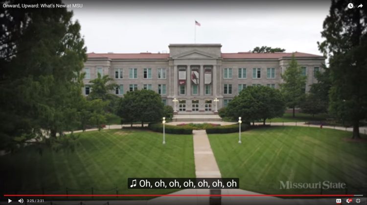
Videos are engaging, effective and entertaining to watch. From Mind’s Eye, FAFSA on fleek and Onward, Upward: What’s new at Missouri State (below) — some of the greatest moments at Missouri State are best captured and shared through video.

I sat down with skilled videographer, Chris Nagle, to learn more about video captioning.

Video captioning is important for accessibility

As a federally-funded institution, we are required to conform to certain accessibility guidelines. Video captioning is included in these guidelines. Once you have a completed a video, adding captions should not be overlooked. Video captioning increases accessibility by reaching audiences regardless of environment, ability or language. With a few quick tips, you can make your video accessible to everyone.

Who benefits from video captioning?

There is a wide range of audiences who enjoy video captioning. Some of these include:

  • People who are deaf and hard-of-hearing.
  • People with cognitive and learning disabilities who need to see and hear the content to better understand it.
  • People who are not proficient in the video’s spoken language.
  • People using a mobile device on silent.
  • People accessing a video in a loud environment or have defective audio.

Even more, content in text form like caption files are better indexed by search engines. Video captioning is effective, and it provides equal opportunity for everyone.

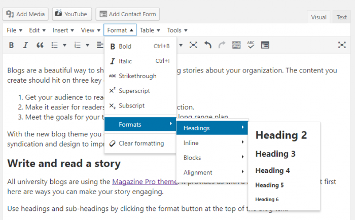
What is video captioning?

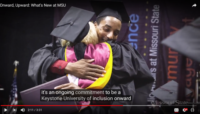
Captions are a text form of audio information in video and animations. Captions should include dialogue and non-speech information such as sound, sound effects and identify who is speaking. Captions are essentially transcripts synchronized with the visual content. As you can see in the screenshot below, there is captioning for the dialogue spoken by the narrator.

student hugging professor at graduation

Quality matters

Keep these guidelines in mind as you create captions:

  • Accurate: Captions must match the spoken words (either verbatim or in essence) in dialogue and convey background noises and other sounds.
  • Synchronous: Captions must appear at approximately the same time audio would be available and displayed at a speed easily read by viewers.
  • Complete: Captions must run from the beginning to the end of the program to its fullest extent possible.
  • Properly placed: Captions should not block other important visual content, overlap one another or run off the edge of the video screen. They should also comply with color contrast guidelines.

What’s an easy way to make video captions?

Luckily, there are service providers that do most of the video captioning work.

Nagle suggested using Rev or 3Play Media for affordable video captioning needs. Nagle often uses Rev, which returns video captioning within 24 hours after uploading a video. He said it is important to be mindful of two things when uploading a video.

First, make sure you are uploading the final, completed video. Secondly, attach any details that are needed such as names and unique spellings.

Upon uploading a video, you can dictate the returned file format depending on the location of your video. For example, you would select SubRip (.srt) for a YouTube video or Facebook ready BubRip (.srt) for Facebook captioning. When the file returns, you can download the file and edit any elements necessary.

Adding captions to YouTube videos

To add captions to YouTube videos, you can use the YouTube Caption Editor or do it yourself.

Using the YouTube Editor

YouTube automatically generates captions for most videos, but they are rarely fully accurate. If there are only a few mistakes, captions can be perfected by making corrections directly in YouTube. YouTube offers instructions for editing captions.

Doing it yourself

If you would rather caption your own video for free, there are several online tools, including:

  • Amara
  • DotSub
  • Subtitle Horse

The process for creating these captions is similar to the process we learned earlier. You will need to upload the video to the web, provide the video’s URL to the captioning service, review and edit the captions and download the caption file in an appropriate format. Lastly, you will want to add the caption file to the YouTube video.


Ask the Web Help Desk

Where can I get more information about making accessible videos?

Nagle gave me an updated WCAG 2.0 for video accessibility document that he uses to answer compliance questions.

Where can I find more information for how to edit YouTube captions?

  • Captioning YouTube videos

Filed Under: web strategy and development Tagged With: Accessibility, Video Captioning, Web Press

Accessibility series: Creating tables

February 16, 2018 by Alyson Epperson

student smiling at a computer

Welcome to our series of posts called, “How to make your website accessible.” We have discussed the ethical and legal reasoning behind accessibility, how to write alternative text, checking color contrast, how to write descriptive links, how to create accessible headings, and limitations on using color to convey content. The accessibility journey continues with the discussion of accessible tables.

Accessible tables are important

The purpose of data tables is to present information in a grid or matrix. Columns and rows are intended to show the meaning of the information within the grid. Users without visual impairments can visually scan a table and make associations between data in the table and their row and/or column.

Users with visual impairments cannot make visual associations. Those using screen readers have the row and column headers read aloud as they navigate through the table. Screen readers speak one cell at a time and reference the associated header cells. Tables without structural markup to differentiate proper header and data cells create accessibility barriers.

Correct HTML markup not only helps those using assistive devices consume content more accurately, but it also improves the functionality that adapts the table layout on mobile devices. This functionality is intended to increase data comprehension and help users avoid zooming and side-scrolling on mobile devices.

What information goes into a table?

Before moving forward, we must talk about the purpose of a table. Tables are used for tabular data, making the HTML markup important to understand. Tabular data requires an ordered arrangement of rows and columns that rely on headers to group information. Tables should not be used for layout or to position elements on your web page.

Back to the basics

Let’s take a stroll through memory lane and recall the layout of rows and columns. Columns run up and down, whereas rows run right to left. As we continue, the importance of rows and columns will be addressed when organizing information in an accessible manner.

As we move forward, we will learn how to add the <thead>,<tbody> and headers.

graphic explaining the layout for columns and rows

Table markup

The <thead> element is used to group header content, the <tbody> element is used to group the body content and the <tfoot> element is used to group footer content. Every table must have a <thead> and <tbody> element for the mobile table styles to be applied.

The purpose of these elements are to specify the parts of a table. Browsers can scroll the body of a table independently of a fixed header or footer. Each of these tags will hold groups of rows inside them. An example is shown below:

Tuition and fees
Item In-state Out-of-state
Estimated totals $12,357 $21,300
Tuition $8,844 $17,787
Student service fees $2,028 $2,028
COB graduate level course fee $1,485 $1,485

<table>
<caption>Tuition and fees</caption>
<thead>
<tr>
<th scope="col" style="width: 70%;">Item</th>
<th scope="col" style="width: 15%;">In-state</th>
<th scope="col" style="width: 15%;">Out-of-state</th>
</tr>
</thead>
<tfoot>
<tr>
<td>Estimated totals</td>
<td>$12,357</td>
<td>$21,300</td>
</tr>
</tfoot>
<tbody>
<tr>
<td>Tuition</td>
<td>$8,844</td>
<td>$17,787</td>
</tr>
<tr>
<td>Student service fees</td>
<td>$2,028</td>
<td>$2,028</td>
</tr>
<tr>
<td>COB graduate level course fee</td>
<td>$1,485</td>
<td>$1,485</td>
</tr>
</tbody>
</table>

Identifying row and column headers

Having designated row and/or column headers is essential to creating an accessible data table. Let’s think of a header as a title for rows and columns. In the markup, the <th> element is used for table header cells.

When a <th> element is used in Web Press, the text will shade the cell background and bold the text.

Associating data cells with appropriate headers

Using “scope” attributes is the easiest way to associate header (<th>) cells and data (<td>) cells. The scope attribute tells a browser and screen reader which data is associated with each header. For example, everything within a column is associated with the scope="col" header. Similarly, it will see that a scope="row" is a header for all cells in that particular row.

For column header cells, simply include scope="col" in the <th> tag. For row header cells, use scope="row" in the <th> tag.

Using columns headers

The table below uses scope="col" to associate column headers to data cells underneath it.

Homework Due Dates Quiz Dates Test Dates
9/2/02 9/4/02 9/6/02
9/23/02 9/25/02 9/27/02
10/14/02 10/16/02 10/18/02


<table width="330">
<tr>
<th scope="col">Homework Due Dates</th>
<th scope="col">Quiz Dates</th>
<th scope="col">Test Dates</th></tr>
<tr>
<td>9/2/02</td>
<td>9/4/02</td>
<td>9/6/02</td></tr>
<tr>
<td>9/23/02</td>
<td>9/25/02</td>
<td>9/27/02</td></tr>
<tr>
<td>10/14/02</td>
<td>10/16/02</td>
<td>10/18/02</td></tr></table>

Using row headers

Let’s suppose we wanted to display students’ scores. To accomplish this, we will need to add row headers on the left side of the table. The table below uses scope="row" to associate row headers to the correct data cells.

Homework 1 Quiz 1 Test 1
Bob 87% 86% 80%
Scott 92% 98% 94%
Tara 94% 82% 91%

<table width="440"><tr><td></td>
<th scope="col">Homework 1</th>
<th scope="col">Quiz 1</th>
<th scope="col">Test 1</th></tr> <tr><th scope="row">Bob</th>
<td>87%</td>
<td>86%</td>
<td>80%</td></tr> <tr><th scope="row">Scott</th>
<td>92%</td>
<td>98%</td>
<td>94%</td></tr> <tr><th scope="row">Tara</th>
<td>94%</td>
<td>82%</td>
<td>91%</td></tr></table>

Making table captions

Data tables typically have a brief descriptive text before the table, indicating the content of a table. The text should be associated with the table using the <caption> element. The <caption> element is used right after the opening <table> tag. The image below helps us understand the role of the <caption> element in a table.

<table>
<caption>Estimated program totals</caption>

The coding above can be visualized like this:

Estimated program totals
Item In-state Out-of-state
Estimated totals $12,357 $21,300
Tuition and fees $12,357 $21,300

Ask the Web Help Desk

How do I make an accessible table in Web Press?

  1. Open the Rich Text Block.
  2. Select Edit Content.
  3. Select the Table icon from the editor toolbar.
    table icon in FreeForm content window
  4. Type the number of rows you want in the Rows box and the number of columns you want inside the Columns box.
    rows and columns boxes inside the table properties window
  5. Select First Row, First Column or Both from the Header drop-down menu, depending on the location of your header(s).
    Note: This will set your <thead> and automatically set other cells as <tbody>.
    header drop-down menu in table properties window
  6. Write the caption of your table in the Caption box.
  7. Select OK.

How do I edit code in the rich text editor?

Inside the rich text editor, select the button toward the right called, “Source View.” This button will allow you to examine and edit the code inside the text table.

How will my table look on a mobile device?

As part of our ongoing campaign to increase the accessibility of Missouri State’s web pages, we have added functionality that adapts the table layout on mobile devices. While this functionality is primarily intended to increase data comprehension, it also helps users avoid zooming and side-scrolling on mobile devices. Our Full Stack Developer/Engineer, Philip Bowles, wrote a blog about rewriting table elements for mobile devices.

More information about semantic HTML elements

You may visit these links for more information about relevant HTML elements.

  • The table element
  • The caption element
  • The thead element
  • The tbody element
  • The tfoot element
  • The th element

Filed Under: Accessibility, web strategy and development Tagged With: Accessibility, Tables, Web Press

Accessibility: Don’t use color alone to convey content

December 13, 2017 by Alyson Epperson

student working on computer

Welcome to our series of posts called, “How to make your website accessible.” We have discussed the ethical and legal reasoning behind accessibility, how to write alternative text, checking color contrast, how to write descriptive links and how to create accessible headings. The accessibility journey is moving onward with the discussion of using color to convey content.

Consider all readers

Color is a powerful visual means in the real and digital world. It conveys mood, adds presence and helps distinguish information. Color provides great design advantages, but when it is relied on to convey content – it can be ineffective.

The use of color to convey meaning creates problems for people with low vision, color perception deficiencies and color blindness. Users who have color deficiencies struggle to navigate their way through color-drenched content.

Don’t use color alone to convey meaning

As we have discussed previously, the purpose of screen readers is to read content aloud to users with visual impairments. It is important to know screen readers do not read aloud visual information. Therefore, the screen reader does not read color information.

Non-visual and visual users who cannot access color must be taken into account when using color to emphasize elements. Information conveyed with color must also be communicated textually to be effective.

The accessible solutions

Don’t be afraid to use color. However, don’t rely on color alone to convey content because it can be ineffective. The best way to design for users with visual impairments or lack access to color is to provide emphasis using text, identifiers, symbols or patterns.

Using text with color

When color is used to instruct a user to take an action, a textual alternative must be provided. For instance, “Select the green button to advance to the next chapter,” is not accessible because not every user can see the color green. Rather, the instructions should read, “Select the green Start button to advance to the next chapter.”

Below is an example of accessible buttons including color and text. Don’t forget to consider color contrast when adding text onto a colored button.

Select the green Start button to advance to the next chapter or the red Cancel button to end.


<button style="background-color: #4caf50; color: white; padding: 10px; border: none;">Start</button>

<button style=”background-color: #f44336; color: white; padding: 10px; border: none;”>Cancel</button>

Using identifiers with color

Required form fields are often identified using red text as a signpost. Screen readers will not identify which text is in red. Consequently, the user with visual impairments will not know which fields are required.

Rather than using just color to identify a required field, it is best to place an asterisk and advise users that “Required fields are red and marked with an asterisk.” A screen reader will read aloud the symbol, allowing the user with visual impairments to identify the required fields.

In Web Press, there is a “required field” option that will automatically place a red asterisk beside the required field.

Having “required” on an element lets the browser know this attribute exists and the corresponding input is a required field. When the required attribute is present, it specifies that an input field must be filled out before submitting a form. If a form is submitted with required fields incomplete, a message will appear to alert the user of the empty field. The image below shows the code behind the form above.

<dl class="ContentBlock Page247285">
<dt><label for="tb247285F" class="RequiredField">First name</label></dt>
<dd><input type="text" name="Field_First_name" placeholder="First name" size="30" required id="tb247285F" /></dd>
<dt><label for="tb247285M">Middle name</label></dt>
<dd><input type="text" name="Field_Middle_name" placeholder="Middle name" size="30" id="tb247285M" /></dd>
<dt><label for="tb247285L" class="RequiredField">Last name</label></dt>
<dd><input type="text" name="Field_Last_name" placeholder="Last name" size="30" required id="tb247285L" /></dd>
</dl>

Using patterns and textures with color

Let’s consider bar graphs. If a user can see color, the graph below is easy to understand because each bar is clearly identifiable and distinguishable.

screenshot of bar graph

If color is removed, it is difficult to distinguish each bar on the graph. A solution would be to include a pattern or textual identifier, in addition to color, on each bar to make it distinguishable for all users. A correct example can see seen below:

screenshot of accessible bar graph

Using shapes with color

Use shapes in addition to color to indicate where problems arise. For example, brand.missouristate.edu uses color and shapes to identify the correct use of grounding bars. The color green and a check mark is used to identify the correct use of grounding bars. Conversely, the color red is used with an X to identify the incorrect use of grounding bars.

screenshot of correct use grounding bars
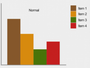
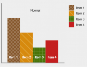
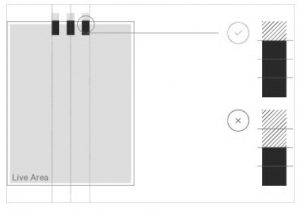
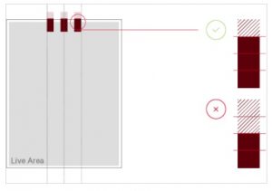
As you can see below, if color is eliminated, a user will still be able to identify which option is correct or incorrect because of the symbol associated with it.

screenshot of correct use grounding bars

Color is your friend

Color should not be a design element that is avoided. Color is an element of visual communication that enhances design, identity and usability. Please think of color as a means to enhance and enliven the display of a page. When used as a supplement, rather than on its own, it can be a great benefit to all web users.


Ask the Web Help Desk

How can I check to see what my webpages look like without color?

Follow the steps below to apply a greyscale filter to your webpage:

  1. Go to the Colorblind Web Page Filter.
  2. Type the URL of your website into the Type a URL box.
  3. Select Greyscale/achromatopsia from the Pick a color filter drop-down menu.
  4. Select Fetch and Filter!

Where can I learn more about color vision deficiencies?

There are several types of color-blindness and visual deficiencies affecting color. You can use a Color Blindness Simulator or watch the video below to learn about each color vision deficiency.

Where can I learn more sufficient techniques to meet this accessibility guideline?

The Web Accessibility Initiative gives great advice, techniques and insight into this accessibility guideline.

Additional questions?

The Web Help Desk is on your team. If you have any questions or need further assistance, please contact the Web Developer Help Desk at WebPress@MissouriState.edu or call 417-836-5271 between the hours of 1 p.m. and 5 p.m. on normal business days.

Filed Under: Accessibility, web strategy and development Tagged With: Accessibility, Color, Web Press

Accessibility series: Headings

November 7, 2017 by Alyson Epperson

Student working on computer

Welcome to our series of posts called, “How to make your website accessible.” So far we have discussed the ethical and legal reasoning behind accessibility, how to write alternative text, checking color contrast, and how to write descriptive links. The accessibility journey is moving onward with the discussion of headings.

Headings vs. paragraphs

A heading is a short phrase describing what a succeeding section is all about. Headings help users determine the overall outline of a document and navigate to specific information on a page. Headings are bold and bigger compared to normal paragraph text. Headings need <h> tags while paragraph text need <p> tags. The images below display the Source View and Rich Text view to better understand the code behind headings and paragraphs.

Heading ranks

Headings are nested according to level or rank. Heading 1 is the most important heading, whereas heading 6 is the least important. Headings with an equal or higher rank start a new section, headings with a lower rank start new subsections that are part of the higher ranked section. In Web Press, Heading 1 is the title of the web page, while Heading 2 serves as a main section.

Heading HTML tags

Heading tags are used to create headings. They are defined with the <h1> to <h6> tags, telling browsers and search engines that this is the most important text on the page.

If you are using Web Press or WordPress, these tags are placed automatically when a heading is selected. If you notice a heading issue but can’t figure out the problem behind it, the HTML elements will likely uncover the issue. In Web Press, click View Source inside the text window to find HTML. In WordPress, click Text in the upper right window tab. You don’t have to be a coding expert to fix headings in HTML as long as you know the heading tags below:

<h1>Heading 1</h1>
<h2>Heading 2</h2>
<h3>Heading 3</h3>
<h4>Heading 4</h4>
<h5>Heading 5</h5>
<h6>Heading 6</h6>

Improving readability

Headings support visual readability. Internet readers tend to inspect webpages in blocks and sections. Splitting information into logical chunks based on headings allows the skimmers to quickly find what they need. Informative and concise headings are effective, giving readers a preview of the information. It is critical to ensure headings have a logical structure.

Increasing accessibility

Users with visual impairments may have headings read aloud by a screen reader. The screen reader will compile a list of headings, rather than reading aloud the entire page. This allows those with visual impairments to easily jump through a website’s sections and navigate to a particular set of information. Heading structure is one of the most important accessibility considerations.

Optimizing search ranking

Search engine optimization (SEO) is the process website owners use to help search engines find, index and rank their web pages — hopefully above others. Instances of <H> tags in text tells a browser—and of course, Google—that the text is important. When a user is searching for specific information, headings communicate to search engines what a website is all about. Because headings are important to users, they directly affect search rankings and optimization.


Ask the Web Help Desk

Why can’t I use bold text instead of a heading?

This is a frequently asked question at the Web Help Desk. Web Press users tend to love the bold look opposed to the smaller, gray Heading 2. In all circumstances, it is best practice to use a heading rather than bold. This will code your heading with the proper <H> for accessibility and search engine optimization.

On a side note: Headings are written in sentence case and don’t include punctuation. This means you only capitalize the first letter of the first word and proper nouns. (Ex: Web content management system)

Even if you think it looks better another way — trust the Help Desk.

How do I access headings in Web Press?

In Web Press, the heading size and color style is set as pre-set. Follow these steps to set a heading:

  1. Select the Open Rich Text Block red dot.
  2. Select the Edit Content red dot.
  3. Highlight the text you wish to make a heading.
  4. Select the heading drop-down list.
  5. Select the appropriate heading in the drop-down menu.
  6. Select OK.

Freeform content block

How do I change the page title?

In Web Press, the Heading 1 is the title of a page. Follow these steps to the change the page title:

  1. Go to the page you are editing in the SmartEdit.
  2. Select the Open Web Page red dot at the top of the page.
  3. Right-click anywhere on the page.
  4. From the drop-down menu, select Edit Properties.
    Edit properties drop-down menu
  5. In the Edit Properties window, type your new page title in the Headline box.
    Edit properties window
  6. Select OK.

How do I access headings in WordPress?

Follow these steps to set a heading in WordPress:

  1. Select Format from the toolbar menu.
  2. Move down the drop-down list and select Formats.
  3. Select Headings
  4. Select the heading you wish to use.
    image of dropdown from the format button at the top of the blog to the headings sub-menu

Further questions?

If you have any questions or need further assistance, please contact the Web Developer Help Desk at WebPress@MissouriState.edu or call 417-836-5271 between the hours of 1 p.m. and 5 p.m. on normal business days.

Filed Under: Accessibility, web strategy and development Tagged With: Accessibility, Headings, Web Press, WordPress

5 ways to engage with Missouri State using social during Welcome Weekend

August 9, 2017 by Alyson Epperson

Students at Welcome Weekend

Once we meet, then we tweet

Missouri State holds the trophy for funniest Twitter in Springfield. Follow your university for the best GIFs, tips and Welcome Weekend coverage. Tell the Twitterverse how much you love your university with #GoMaroon.

Students at Playfair

Make new memories on Snapchat

Add Missouri State on Snapchat to discover where the action is happening during Welcome Weekend. Show off your photogenic campus by using the Missouri State filters! Save them to your memories because this will be a weekend worth remembering.

snapchat code

Join the live Bear Path

Join us live on Facebook at 3 p.m. Aug. 20 as we walk through Bear Path! You will not want to miss this energetic welcome from the Missouri State faculty, staff and students.

Students at Bear Path

Insta-this!

Follow Missouri State on Instagram for the best photos of students, campus and all things Missouri State. These photos will stop your scroll and demand a heart. Use the #GoMaroon to share your photos and start your collection as a Bear.

Students take a selfie

Watch for our cameras, too!

If you put your phone down to take in this unforgettable weekend – don’t worry, all of it will be captured for you. Video cameras might catch you moving into your new home, high-fiving friends at Playfair and smiling every moment in between. Don’t believe us? Watch this.

Filed Under: web strategy and development Tagged With: facebook, instagram, snapchat, Social Media, Twitter, welcome weekend

Subscribe

Enter your email address to subscribe to this blog and receive notifications of new posts by email.

Follow @MSUWeb

My Tweets

Calendar

  • Complete Calendar

Categories

  • Accessibility
  • brand
  • email marketing
  • Mobile
  • News
  • Omni CMS
  • Redesign
    • Academic websites
    • Web redesign 2015
  • Social media
    • Social media kit
  • template
    • updates
  • Training
  • Video
  • Web Press
  • web strategy and development
    • Technical
  • Web Support
  • WordPress blogs

Meta

  • Log in
  • Entries feed
  • Comments feed
  • WordPress.org

Connect with web strategy and development

  • Twitter

Make your Missouri statementMake your Missouri statement
  • Last Modified: August 9, 2017
  • Accessibility
  • Disclaimer
  • Disclosures
  • EO/AA/M/F/Veterans/Disability/Sexual Orientation/Gender Identity
  • © 2013 Board of Governors, Missouri State University
  • Contact Information
 

Loading Comments...