
Considering table accessibility
The web accessibility of HTML tables is notoriously tricky to manage. As part of our ongoing campaign to increase the accessibility of Missouri State’s web pages, we’ve added functionality that adapts the table layout on mobile devices.
While this functionality is primarily intended to increase data comprehension, it also helps users avoid zooming and side-scrolling on mobile devices. Furthermore, enforcing correct semantic HTML markup improves the accessibility of tables on our site. Providing valid and predictable tabular structures helps assistive devices such as screen readers consume our content more accurately and effectively.
How might a rewritten table look on mobile devices?
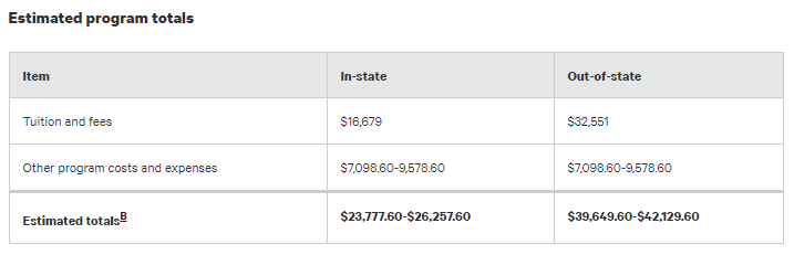
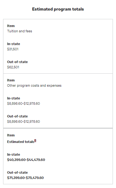
The following screenshots provide an example of how a table similar to the one above might appear when reformatted on mobile devices. The first image shows the how it might look on a desktop computer. The second image shows that same table in a mobile context after the script processes the content.
Example structure
The basic outline of a table structure that will be reformatted for mobile devices is as follows:
<table>
<caption>Optional but recommended caption describing the purpose or contents of the table.</caption>
<thead>
<tr>
<th>Column 1 Header</th>
<th>Column 2 Header</th>
</tr>
</thead>
<tbody>
<tr>
<td>Column 1, row 1 data</td>
<td>Column 2, column 1 data</td>
</tr>
<tr>
<td>Row 2, column 1 data</td>
<td>Row 2, column 2 data</td>
</tr>
</tbody>
<tfoot>
<tr>
<td>Optional footer row column 1 data</td>
<td>Optional footer row column 2 data</td>
</tr>
</tfoot>
</table>
We can visualize the above HTML like this:
| Column 1 header | Column 2 header |
|---|---|
| Column 1, row 1 data | Column 2, row 1 data |
| Column 1, row 2 data | Column 2, row 2 data |
| Optional footer row column 1 data | Optional footer row column 2 data |
Restriction and enforcement
Current and future versions of Missouri State’s common.js file contain a small script that dynamically rewrites table elements on a page when viewed on a mobile device. It does this by placing the text of the column headers (th elements) into their corresponding data cells (td elements) throughout the table as data attributes. We use CSS to restyle the content in order to make the data easier to understand.
Our script performs several checks against the structure of a data table, then decides whether or not that table should be redrawn for mobile devices. The script will refuse to process a table if that table’s structure does not conform to a specified pattern of elements. The current HTML requirements for a table to be eligible for mobile processing are as follows:
- A table must have 1 and only 1
theadelement - The table must have 1 and only 1
tbodyelement - The table may have 0 or 1
tfootelement(s) - Any
thelements in the table must be used as column headers and placed in thetheadelement
Why are there limitations?
These restrictions are in place to avoid incorrectly processing multi-dimensional or otherwise complex tabular structures. The key advantage to this approach is that simple, informative data tables receive the added benefit of being rendered in a more readable format on mobile devices. Conversely, complex tables can be overridden to retain their specified readability as necessary. If a table violates any of the above rules, the script dynamically adds a class to that table to discourage mobile reformatting. Notably, web editors can manually add the override class (“TableOverride”) to their markup to prevent those tables from being reformatted in mobile contexts.
The enforcement of these structures is also beneficial to assistive technologies like screen readers because simple tables are easier to parse. Simplifying or “flattening” tables into smaller, more consumable chunks is better for end users and more efficient for machines.
In addition to the requirements outlined above, we also recommend using caption elements to describe the purpose of your tables. Table captions are widely accepted as beneficial to the overall accessibility of a web page.
Notes on our accessible table implementation
Currently, our script does not offer support for tables with row headers. It will also refuse to process any tables with th elements used for row headers within the tbody or tfoot elements. Our development roadmap includes plans to eventually accommodate th elements when used as row headers, most likely in conjunction with the scope attribute.
Additionally, tables may exhibit unexpected behavior when colgroup or col elements are present. At this time, the script ignores these elements during processing. However, it is probably best to avoid these tags if you wish for mobile devices to correctly display your redrawn tables. If you find that you must use colgroup or col elements in your table, you should consider adding the override class in order to discourage processing by the script.
Also, remember to only use a table for its intended purpose: displaying data to users. For design and layout purposes, it is better to use a block-level tag such as a div. In addition, our current Web Press template provides a method for organizing the layout of your content.
More information about semantic HTML elements
You may visit these links for more information about relevant HTML elements.
- The
tableelement - The
captionelement - The
theadelement - The
tbodyelement - The
tfootelement - The
thelement
- Rewriting table elements for mobile devices - August 21, 2017