Missouri State University

Skip to content Skip to navigation
a b c d e f g h i j k l m n o p q r s t u v w x y z

Web Strategy and Development Blog

  • Web strategy and development
  • Services Offered
  • @msuweb

Redesigned biology website: Diverse programs in a mobile-friendly format

January 7, 2016 by Lucie Amberg

Photo and description of the Gulf Coast Research Lab, as depicted on the facilities and resources page

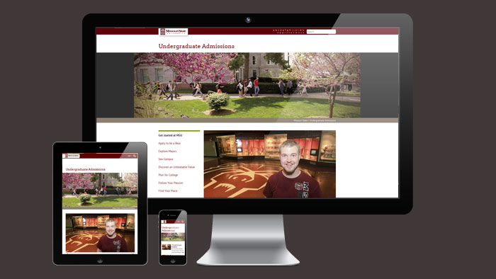
The redesigned biology website recently launched as part of the Academic Website Project. It is the fifth academic website to receive a full redesign for the mobile-friendly template, a process that includes the creation of new content, design and multimedia elements.

Clarifying programs and resources

The biology department is home to a diverse range of programs and research centers. Given the options and opportunities for prospective students, providing clarity became a focus of the redesign.

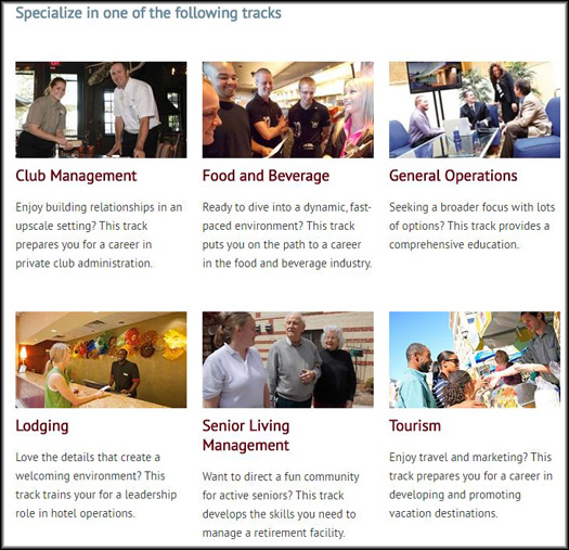
Each program now has its own sub-section on the website, where information regarding that program is gathered.

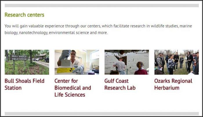
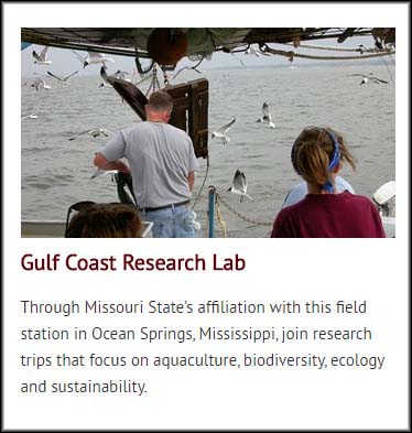
The department’s research centers — meaningful recruitment tools — are highlighted in a prominent section of the website’s homepage. The Facilities and Resources page then features expanded descriptions of each center.

The research centers of the biology department, as featured on the homepage

Photo and description of the Gulf Coast Research Lab, as depicted on the facilities and resources page

Using video resources

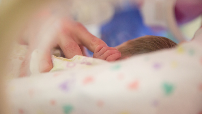
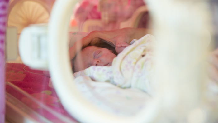
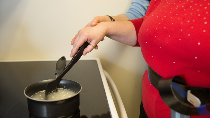
This redesign included the creation of one new video, which highlights the department’s emphasis on research:

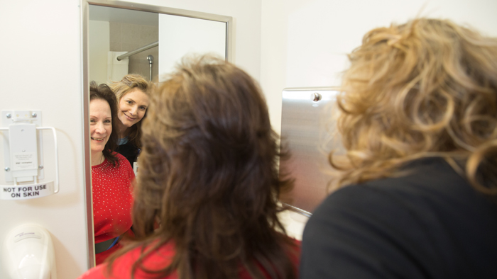
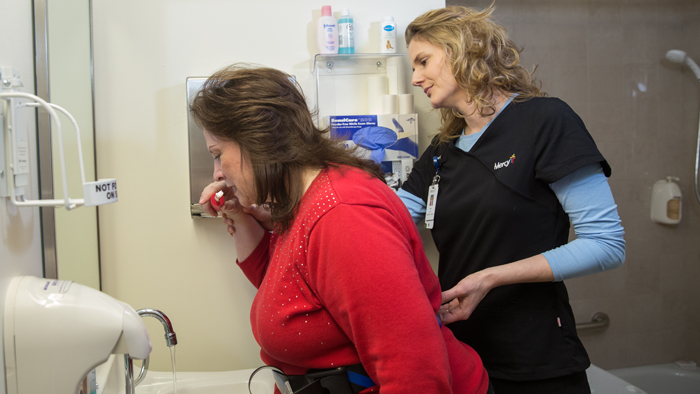
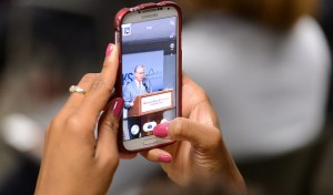
In addition, we were able to leverage videos that were created for other purposes. For example, the following video of a biology alumnus became a valuable addition to the Careers and Outcomes page for the Master of Science in Biology.

Site credits

  • Project lead and content: Lucie Amberg, new media specialist in the office of Web and new media
  • Design: Veronica Adinegara, senior graphic designer in the office of publications
  • Photography: Kevin White, senior photographer in photo services
  • Videography: Sara Silkwood, videographer in photo services
  • Editor: Nicki Donnelson, public relations specialist in University communications
  • Implementation: Brian Heaton, content management programmer in the office of Web and new media, with Lucie Amberg and Sara Clark, director of the office of Web and new media, and student coder Max Orlando

Filed Under: Academic websites, Mobile, Redesign, Web redesign 2015, web strategy and development Tagged With: academic websites, biology, mobile, mobile redesign, Redesign

Redesigned sports medicine and athletic training website: Tradition, achievement and energy

October 8, 2015 by Lucie Amberg

Infant grabbing the finger of an occupational therapist

The redesigned sports medicine and athletic training website recently launched as part of the Academic Website Project. This is the fourth academic website to receive a full redesign for the mobile-friendly template.

Excellence and opportunity

During the content development phase of the project, the athletic training program’s reputation for excellence repeatedly emerged as a theme. Both faculty and students mentioned:

  • The program’s long history of accreditation
  • The high scores graduates tend to earn on the Board of Certification exam
  • The program’s remarkable job placement rate

These ideas became the focus of the content and are layered throughout the website — in both text and multimedia. This video, which features two sisters who both chose Missouri State’s athletic training program, provides an example:

Keeping students connected

The redesigned website also provides opportunities to showcase the department’s very active digital communication channels. The news feeds from these channels are integrated into the website’s design, and the following channels are available via buttons in the site’s footer:

  • Sports medicine and athletic training blog
  • Twitter
  • Facebook

Introducing a new program

The redesign process coincided with the introduction of a highly anticipated new program within the department of sports medicine and athletic training: the Master of Occupational Therapy. Creating a website for a program in the foundational stage presented an interesting challenge. The vision for the program was represented through photography of the faculty members in their own work spaces, which provides a window through which prospective students may glimpse their own careers.

Selection of occupational therapy photos

Occupational therapist with infant
Infant grabbing the finger of an occupational therapist
Infant patient with occupational therapist
Occupational therapist with adult patient
Occupational therapist helping a patient brush teeth
Occupational therapist assisting a patient with cooking skills

Site credits

  • Project lead and content: Lucie Amberg, new media specialist in the office of Web and new media
  • Design: Abby Isackson, graphic designer in the office of publications
  • Photography: Jesse Scheve, staff photographer in photo services
  • Videography: Chris Nagle, videographer in photo services
  • Editor: Don Hendricks, director of the office of University communications
  • Implementation: Brian Heaton, content management programmer in the office of Web and new media, with Lucie Amberg and Sara Clark, director of the office of Web and new media, and student coders Brandon Fitzlaff and Max Orlando

Filed Under: Academic websites, Mobile, Redesign, Web redesign 2015, web strategy and development Tagged With: ATEP, athletic training, mobile, mobile friendly, occupational therapy, Redesign, SMAT OT, sports medicine, sportsmed, website

Academic Website Project: Converting to mobile FAQ

May 6, 2015 by Lucie Amberg

Using a cell phone

Website viewsThis semester, the office of Web and new media began converting all departmental websites to the mobile-friendly template.

As part of the Academic Website Project, this effort is funded by the office of the provost. Websites will be converted according to the deans’ prioritization on a college-by-college rotation.

Frequently asked questions

Why are we converting to mobile?

Smart phone and tablet usage continues to grow exponentially — particularly with our largest target demographic. In addition, last month Google updated its search algorithm, expanding its use of mobile-friendliness as a ranking signal in organic search results.

What’s involved in the mobile conversion process?

Conversion rather than redesign

The mobile conversion process is not a redesign of your website.

Certain academic websites (Examples: marketing, hospitality and restaurant administration, area studies) have been redesigned according to mobile-friendly specifications; during the redesign process, these sites received new content — including text, design elements, photos and videos. But during a conversion process, new content will not be created for your website.

Incorporating existing multimedia content

However, we will be looking for ways to incorporate content that has already been created for your program. Whenever possible, we will add multimedia pieces such as Mind’s Eye and spotlight videos, provided that they support your program’s recruitment goals and meet other content guidelines.

If you know of existing multimedia content you’d like to add to your website, please feel free to let us know about it once we begin your conversion process.

Future redesign

In the future, any academic website that goes through the mobile conversion process will also receive a complete redesign as part of the Academic Website Project. At that point, we will be creating new content.

Student looking at mobile phone

I represent an academic department. How do I get the process started?

Commencing the conversion

You don’t need to do anything.

  • The conversion process is funded by the office of the provost.
  • Your department has already been prioritized by your dean.
  • Web and new media will contact you via email when your website is entering conversion.

During the conversion

While your website is being converted, you will not be able to edit your live website. Instead, you’ll send updates to webpress@missouristate.edu. We will make updates on your behalf.

Following the conversion

  • Once the conversion is complete, you’ll be notified that your website is ready for your review.
  • At this time, you’ll have the opportunity to send feedback and request changes.
  • Please keep in mind that we will not be revising your content during this process. (If you’d like to make content revisions, you will have that opportunity once your mobile-friendly website has been launched and you have resumed responsibility for maintaining it.)
  • Your website will be launched four weeks after the date you are notified that it’s ready for review.

Once it’s converted, will we still be using Web Press?

Yes, you’ll continue to manage your website through Web Press.

I’m part of a University unit that isn’t an academic department. How do we start the mobile conversion process?

Mobile conversion isn’t fully available to non-academic departments yet. We are working through that process and will post when available. You’re welcome to email web@missouristate.edu if you’d like to be an early conversion client.

Filed Under: Academic websites, Mobile, Redesign, Web Press, web strategy and development Tagged With: academic website, conversion, mobile, mobile friendly, recruitment, Redesign, website conversion

Redesigned HRA website: Welcoming and mobile-adaptive

February 27, 2015 by Lucie Amberg

The HRA BS program page, which illustrates emphasis areas with photos from private clubs, restaurants, hotels and more

The redesigned hospitality and restaurant administration website recently launched as part of the Academic Website Project. It was the second academic website to receive a mobile-happy makeover, making it adaptive to smartphones and tablets.

Sophisticated color palette, welcoming photos

Designer Veronica Adinegara chose the blue and gray color scheme because it evokes the department’s professionalism and sophistication. She selected photos (many of which were supplied by the department) that underscore the connection between the HRA curriculum and students’ real-world experiences in private clubs, restaurants, hotels and other hospitality environments.

The HRA BS program page, which illustrates emphasis areas with photos from private clubs, restaurants, hotels and more
Photos of real-world experiences paired with high-impact text connect the HRA curriculum to career outcomes.

Consistent message of success

The office of University publications had already created successful recruiting pieces for HRA, which served as inspiration for the written content. Many of these words and ideas – particularly the focus on leadership and internships – were identified as being key to student recruitment. These ideas are incorporated throughout the site.

Streamlined organization

One challenge was making the available degree options clear to prospective students. All students are eligible for the BS in hospitality and restaurant administration, which offers opportunities to specialize in certain areas. Students who have already completed an AAS degree in either hospitality or culinary arts are also eligible for the BAS program.

During the redesign process, distinct program pages were created that illustrate the differences between the BS and BAS programs. A new Advisement page was also created, which gathers resources for both programs.

Site credits

  • Project lead and content: Lucie Amberg, new media specialist, Web and new media
  • Design: Veronica Adinegara, senior graphic designer, University publications
  • Photography lead: Kevin White, senior photographer, photographic services
  • Editor: Nicki Donnelson, public relations specialist, University communications
  • Implementation: Micah Meadows, Web and new media student team member, with oversight from Lucie Amberg, Brian Heaton, content management programmer/analyst, and Sara Clark, director of Web and new media

Filed Under: Academic websites, Redesign, Web redesign 2015 Tagged With: academic website, hospitality and restaurant administration, HRA, mobile, Redesign

New marketing website introduces mobile-happy academic design

February 25, 2015 by Lucie Amberg

Logistics and supply chain management program page

The redesigned marketing department website recently launched, marking a new phase in the Academic Website Project: mobile-adaptive design.

The new mobile design is not only optimized to reach prospective students where they are (on smartphones and tablets), it also allows for a richer multi-media experience.

Logistics and supply chain management program page
Videos about the marketing department’s programs work with efficient, high-impact text to give prospective students a clear idea of each program’s benefits

Interactive experience

Marketing department graduate assistant Lauren Cook produced a number of videos over the course of the project. As a result, designer Abby Isackson chose to build the design around video elements. She said, “I felt that the videos would be a great interactive focus for prospective students to see when scoping out the department.”

Word cloud from the marketing blog emphasizes themes such as "exceoptional faculty" and "real-world experience"
A word cloud from the marketing department blog illustrates some important words and themes

Streamlined organization

The website also received a streamlined organizational structure that leverages existing University systems whenever possible. For example, new courses and faculty and staff pages pull content from existing University systems – minimizing maintenance for the marketing department.

Content highlights meaningful themes

New written content was based on the words and ideas that resonate with marketing students. In particular, themes of “real-world experience” and “exceptional faculty” are carried throughout the sight. Content was constructed according to mobile-first strategy, which emphasizes concise, high-impact language.

Site credits

  • Project lead and content: Lucie Amberg, new media specialist, Web and new media
  • Design: Abby Isackson, graphic designer, University publications
  • Videos: Lauren Cook, graduate assistant, marketing department
  • Photography lead: Kevin White, senior photographer, photographic services
  • Implementation: Micah Meadows, Web and new media student team member, with oversight from Lucie Amberg, Brian Heaton, content management programmer/analyst, and Sara Clark, director of Web and new media

Filed Under: Academic websites, Mobile, Redesign, Web redesign 2015 Tagged With: academic website, marketing, mobile, Redesign

« Previous Page
Next Page »

Subscribe

Enter your email address to subscribe to this blog and receive notifications of new posts by email.

Follow @MSUWeb

My Tweets

Calendar

  • Complete Calendar

Categories

  • Accessibility
  • brand
  • email marketing
  • Mobile
  • News
  • Redesign
    • Academic websites
    • Web redesign 2010
    • Web redesign 2015
  • Social media
    • Social media kit
  • template
    • updates
  • Training
  • Video
  • Web Press
  • web strategy and development
    • Technical
  • WordPress blogs

Meta

  • Log in
  • Entries feed
  • Comments feed
  • WordPress.org

Connect with web strategy and development

  • Twitter

Make your Missouri statementMake your Missouri statement
  • Last Modified: March 17, 2015
  • Accessibility
  • Disclaimer
  • Disclosures
  • EO/AA/M/F/Veterans/Disability/Sexual Orientation/Gender Identity
  • © 2013 Board of Governors, Missouri State University
  • Contact Information