Missouri State University

Skip to content Skip to navigation
a b c d e f g h i j k l m n o p q r s t u v w x y z

Web Strategy and Development Blog

  • Web Strategy and Development
  • Web Support
  • @msuweb

Redesigned physical therapy website: Identity and student success

April 10, 2017 by Kai Raymer

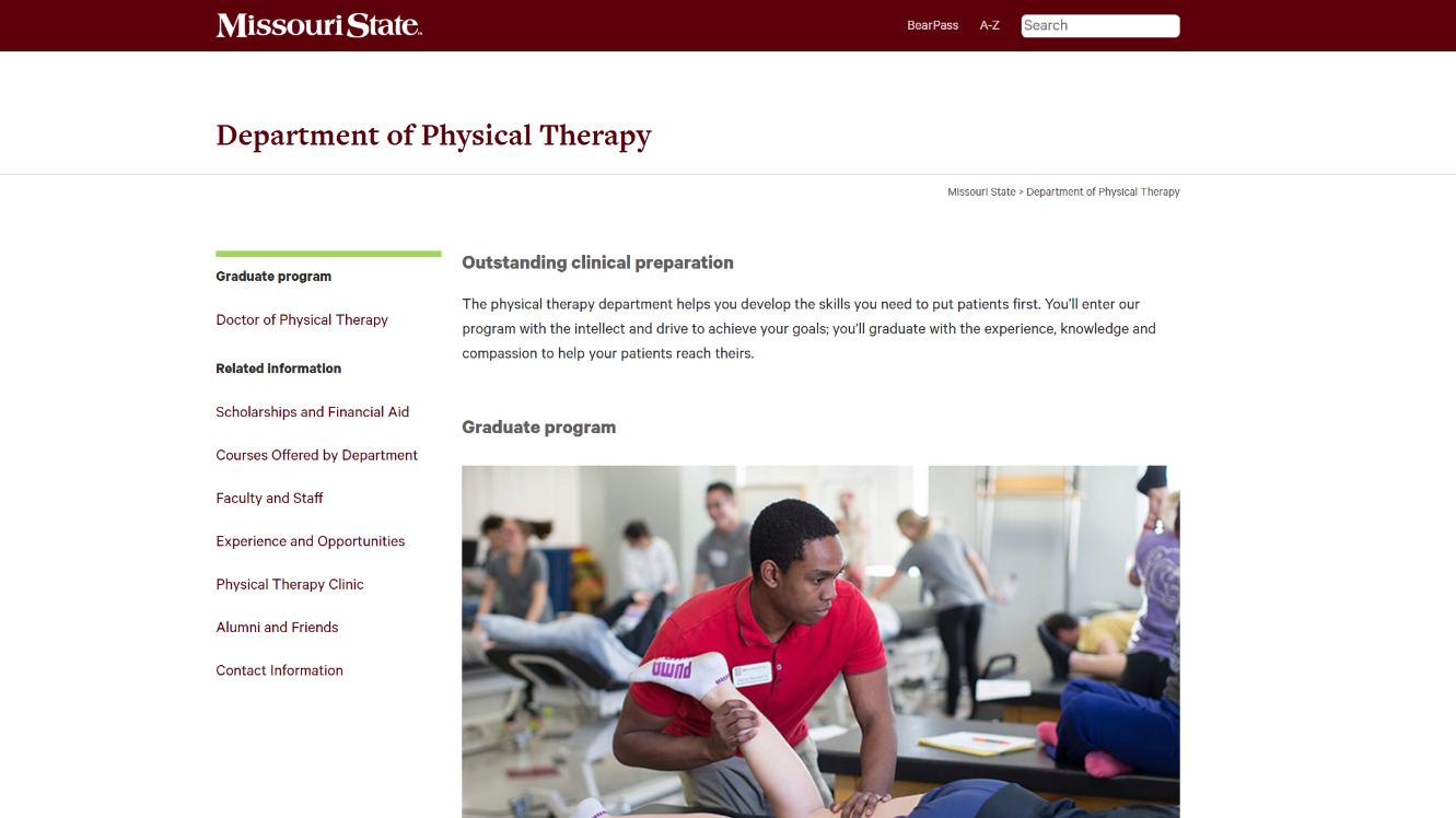
The new homepage of the physical therapy department website.

The redesigned physical therapy website recently launched as part of the academic website project. It is the latest academic website to receive a full redesign for the mobile-friendly template, a process that includes the creation of new content, design and multimedia elements.

Visual improvement

The redesigned homepage features distinct headers, brevity and a centerpiece photo showcasing a department student in action. Fresh photos give an identity to physical therapy students and faculty.

PT student in action.
A physical therapy student demonstrates techniques learned within the program.

Links on the left side of the page were also prioritized. Visitors are now one click away from high-interest department information such as curriculum and scholarships and financial aid.

Student achievements

Since 2009, the physical therapy department has held an ultimate pass rate of 100 percent. This information is highlighted in a call to action block on the home page, which links to year-by-year graduation rates – a vital recruiting tool for the department.
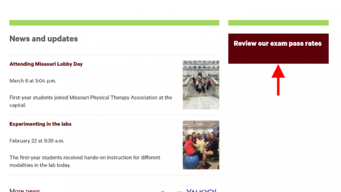
PT exam pass rates.
Exam pass rates a focal point for the physical therapy department.

Experience and opportunities

What, and where, will you be learning in the physical therapy department? Find out by visiting the Experience and Opportunities page, which explains your potential full-scale educational experience and the amenities of McQueary Family Health Sciences Hall.

Site credits

  • Project lead and content: Lucie Amberg, new media specialist, office of web and new media
  • Design: Abby Isackson
  • Photography: Bob Linder
  • Videography: Carter Williams
  • Editor: Nicki Donnelson
  • Implementation: Alyson Jones and Louis Freeman, with oversight from Brian Heaton

Filed Under: Academic websites, Mobile, News, Redesign, Web Press, Web redesign 2015, web strategy and development, WordPress blogs Tagged With: academic website, academic website project, mobile, mobile friendly, mobile redesign, physical therapy, Redesign

Redesigned physician assistant studies website: Academic excellence + work-life balance

October 3, 2016 by Lucie Amberg

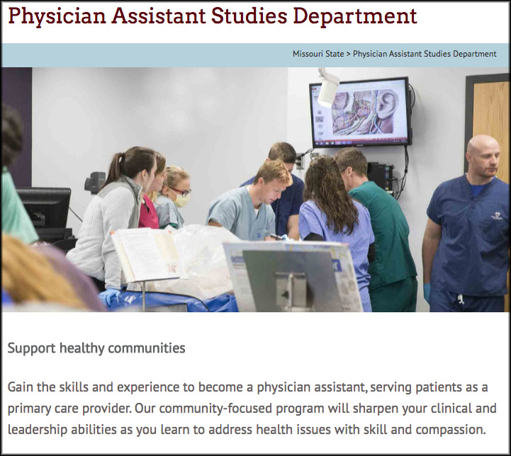
Homepage of the physician assistant studies website

The redesigned physician assistant studies website recently launched as part of the Academic Website Project. It is the seventh academic website to receive a full redesign for the mobile-friendly website template, a process that includes the creation of new content, design and multimedia elements.

Homepage of the physician assistant studies website

Clarifying and communicating unique benefits

Early in the redesign process, we worked with the department to identify the following recruitment messages:

  • Physician assistants play a vital role in health care while also maintaining a positive work-life balance.
  • Missouri State’s physician assistant studies program allows students to finish in just 24 months — faster than many other PA programs.
  • Graduates of this program have a history of success on the physician assistant certification exam.

Emphasizing key recruitment messages

Photography throughout the site features physician assistants in action and students learning through hands-on experiences. The careers and outcomes page emphasizes the positive work-life balance associated with the profession.

The program’s efficiency, which gives it a strong recruitment advantage over programs that take longer to complete, is spotlighted on both the departmental homepage and the physician assistant program page. These pages consistently reinforce the message, “You will finish our program in just 24 months.”

The website highlights graduates’ success on the certification exam, which is required for anyone wishing to practice as a physician assistant. These pass rates have a permanent home on the exam pass rates page.

Site credits

  • Project lead and content: Lucie Amberg, new media specialist in the office of Web and new media
  • Design: Abby Isackson, graphic designer in the office of publications
  • Photography: Kevin White, senior photographer in the office of publications
  • Editor: Kevin Agee, new media specialist in the offices of communications and Web and new media
  • Implementation: Brian Heaton, content management programmer in the office of Web and new media, with Lucie Amberg and Sara Clark, director of the office of Web and new media, and student coder Louis Freeman

Filed Under: Academic websites, Mobile, Web redesign 2015 Tagged With: academic website, mobile, mobile friendly, recruitment, Redesign

Calendar is now mobile friendly

June 2, 2016 by

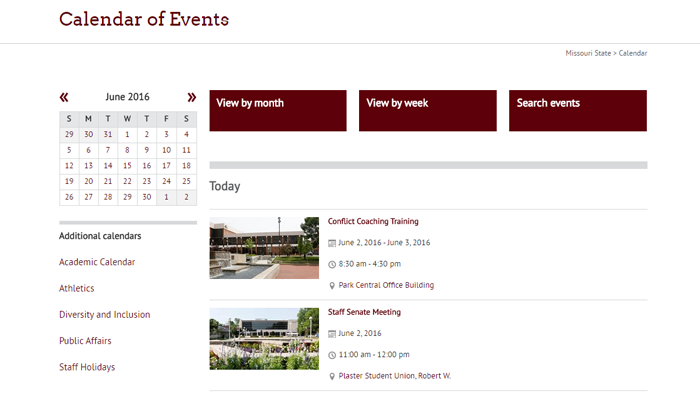
2016 Missouri State University Calendar Website

This week, we rolled out an all new version of the Calendar website. This was both a major brush-up of the user interface and a much-needed overhaul of the underlying technical infrastructure of the site.

Missouri State University Calendar Website

The biggest change is that the calendar site is now in our new mobile-responsive templates. We’ve been hard at work converting our web presence to the mobile friendly template, and getting a core site like the calendar is a big step forward in that effort.

We’ve thrown in some features as well. Events can now have a photo or YouTube video embedded in them, with default photos for most campus locations.

Searching and filtering events should be easier as well. We’ve updated the set of predefined keywords to a descriptive list of event categories that you can easily use on the agenda, week, and month views. Similar filters are available for audience, sponsor, and event location. Under the hood, the HTML markup behind every event’s details page has been updated to embrace a widely used standard to make it friendlier to search engines. This will be especially helpful for the coming updates to our search site.

We’ve also laid the technical groundwork for future updates to the site, including featured events. Stay tuned for further updates!

This project has been years in development, and we’re extremely glad to finally get it out to share with the campus.

Filed Under: Mobile, Redesign, Technical, Web redesign 2015, web strategy and development

Redesigned biology website: Diverse programs in a mobile-friendly format

January 7, 2016 by Lucie Amberg

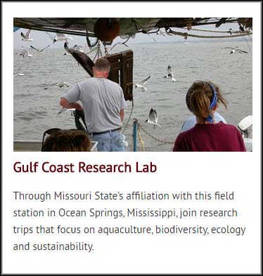
Photo and description of the Gulf Coast Research Lab, as depicted on the facilities and resources page

The redesigned biology website recently launched as part of the Academic Website Project. It is the fifth academic website to receive a full redesign for the mobile-friendly template, a process that includes the creation of new content, design and multimedia elements.

Clarifying programs and resources

The biology department is home to a diverse range of programs and research centers. Given the options and opportunities for prospective students, providing clarity became a focus of the redesign.

Each program now has its own sub-section on the website, where information regarding that program is gathered.

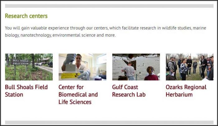
The department’s research centers — meaningful recruitment tools — are highlighted in a prominent section of the website’s homepage. The Facilities and Resources page then features expanded descriptions of each center.

The research centers of the biology department, as featured on the homepage

Photo and description of the Gulf Coast Research Lab, as depicted on the facilities and resources page

Using video resources

This redesign included the creation of one new video, which highlights the department’s emphasis on research:

In addition, we were able to leverage videos that were created for other purposes. For example, the following video of a biology alumnus became a valuable addition to the Careers and Outcomes page for the Master of Science in Biology.

Site credits

  • Project lead and content: Lucie Amberg, new media specialist in the office of Web and new media
  • Design: Veronica Adinegara, senior graphic designer in the office of publications
  • Photography: Kevin White, senior photographer in photo services
  • Videography: Sara Silkwood, videographer in photo services
  • Editor: Nicki Donnelson, public relations specialist in University communications
  • Implementation: Brian Heaton, content management programmer in the office of Web and new media, with Lucie Amberg and Sara Clark, director of the office of Web and new media, and student coder Max Orlando

Filed Under: Academic websites, Mobile, Redesign, Web redesign 2015, web strategy and development Tagged With: academic websites, biology, mobile, mobile redesign, Redesign

Mobile-friendly academic website conversions: Fall 2015

December 10, 2015 by Lucie Amberg

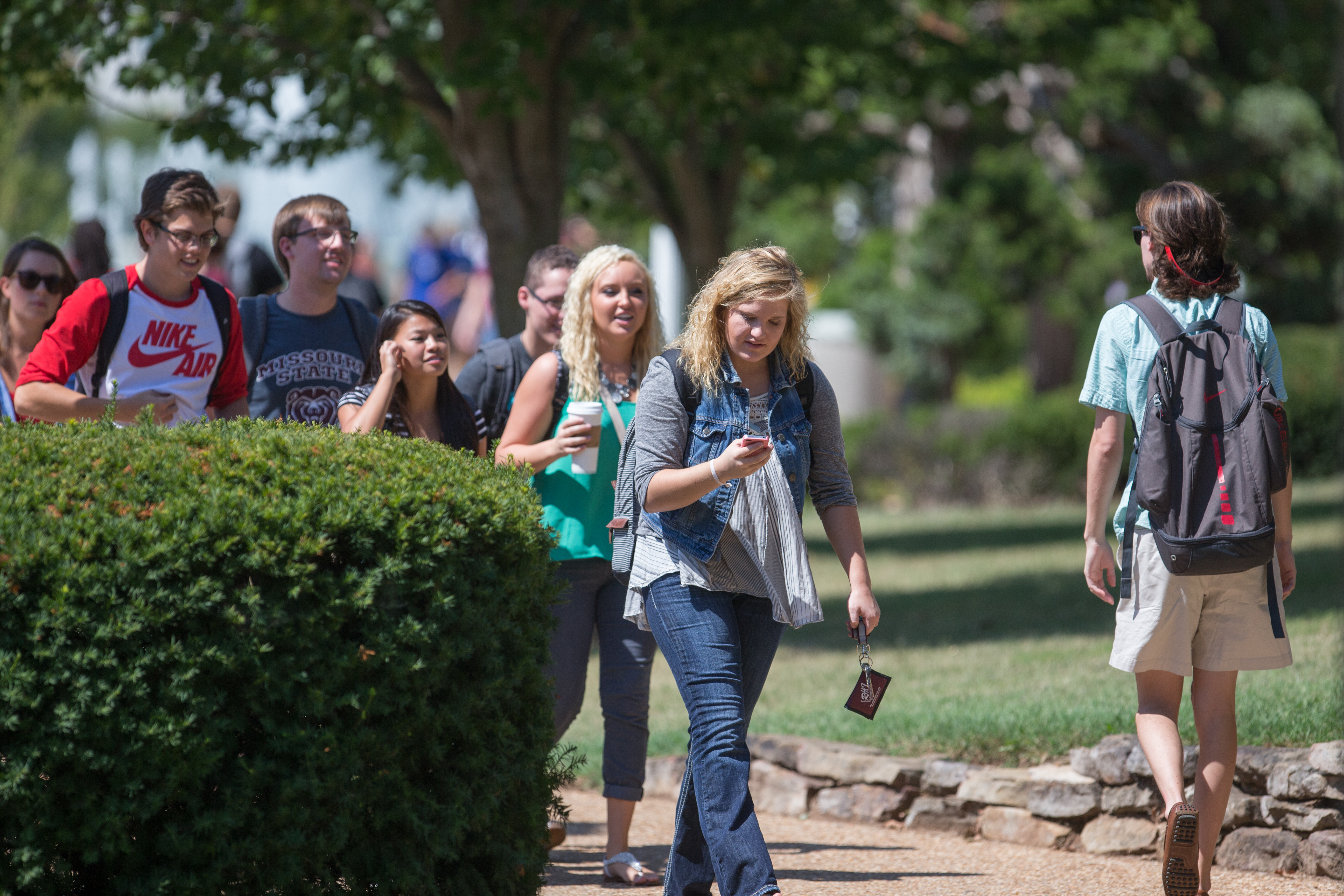
Students walking on campus while looking at smartphones

Students walking on campus while looking at smartphonesMobile usage is growing exponentially — particularly among our largest demographics of prospective students, Millennials and Gen Z.

In 2015, Google experienced two mobile milestones:

  • The mobile tipping point, in which the number of mobile searches in the U.S. surpassed searches on PCs
  • Mobilegeddon, a change to the Google search algorithm that benefits mobile-friendly websites over their non-mobile-friendly counterparts

Academic websites converting to mobile

Our office began the process of converting all academic department websites to a mobile-friendly format early this year.

The conversion process is not a complete redesign. Instead, it converts each site to the mobile template and reorganizes existing content for consumption on mobile devices.

Like the academic website redesigns, conversions are funded by the provost’s office and processed on a college-by-college rotation according to the deans’ prioritization.

Websites that are converted to the mobile-friendly template will later undergo redesign, during which new content, multimedia elements and design elements will be created. This two-step process allows our office to optimize all academic websites for mobile consumption as quickly as possible.

Fall 2015 progress

During the fall semester, we published the following mobile-friendly website conversions:

  • Master of Health Administration
  • Biomedical Sciences
  • Master of Public Health
  • History
  • Computer Science
  • English
  • Music
  • Reading, Foundations and Technology
  • Computer Information Systems
  • Religious Studies
  • Philosophy


Filed Under: Academic websites, Mobile, Web redesign 2015, web strategy and development Tagged With: conversion, mobile, mobile firendly, recruitment

Next Page »

Subscribe

Enter your email address to subscribe to this blog and receive notifications of new posts by email.

Follow @MSUWeb

My Tweets

Calendar

  • Complete Calendar

Categories

  • Accessibility
  • brand
  • email marketing
  • Mobile
  • News
  • Omni CMS
  • Redesign
    • Academic websites
    • Web redesign 2015
  • Social media
    • Social media kit
  • template
    • updates
  • Training
  • Video
  • Web Press
  • web strategy and development
    • Technical
  • Web Support
  • WordPress blogs

Meta

  • Log in
  • Entries feed
  • Comments feed
  • WordPress.org

Connect with web strategy and development

  • Twitter

Make your Missouri statementMake your Missouri statement
  • Last Modified: December 10, 2015
  • Accessibility
  • Disclaimer
  • Disclosures
  • EO/AA/M/F/Veterans/Disability/Sexual Orientation/Gender Identity
  • © 2013 Board of Governors, Missouri State University
  • Contact Information
 

Loading Comments...