Missouri State University

Skip to content Skip to navigation
a b c d e f g h i j k l m n o p q r s t u v w x y z

Web Strategy and Development Blog

  • Web Strategy and Development
  • Web Support
  • @msuweb

Lessons learned from the Alumni Association and Bear Bulletin redesigns

March 2, 2018 by Web Strategy and Development

person using mouse at computer

We recently, by that I mean a year ago, decided it was time to redesign the Alumni Association’s digital communications. Before embarking on this glorious journey we first needed to figure out what we wanted to do and why we’re doing it.

Make a game plan

We developed a set of goals to help us keep our audience in mind.

  1. User access to information on mobile devices
  2. Clear calls to act for alumni to engage with the university
  3. Streamline university news with alumni-centered stories from the printed magazine
  4. Implement our sub-brand across all communication platforms

Then laid out the three phases we planned to execute.

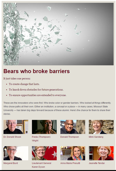
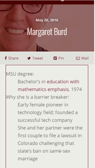
Phase 1 – Missouri State Magazine online

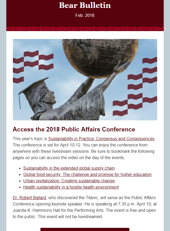
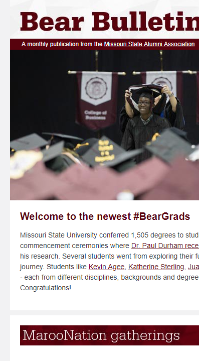
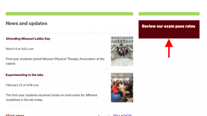
During this phase we found alumni want to get their printed magazine in an easy to read online format. So, we tore down the old magazine site and built a new blog. Through the use of syndication, we are able to pull real-time stories from the university communications department. We can now feature stories from the news, highlight faculty work, showcase student awards and give a home to all the alumni stories. The Bear Bulletin blog is mobile friendly and ties directly to our website.

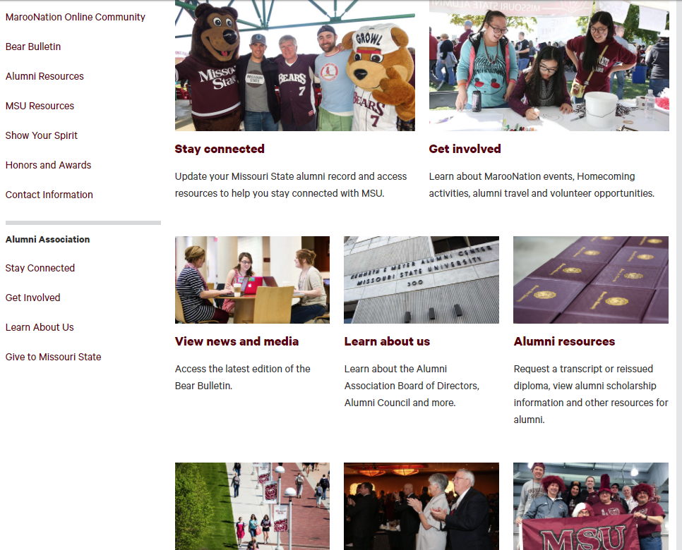
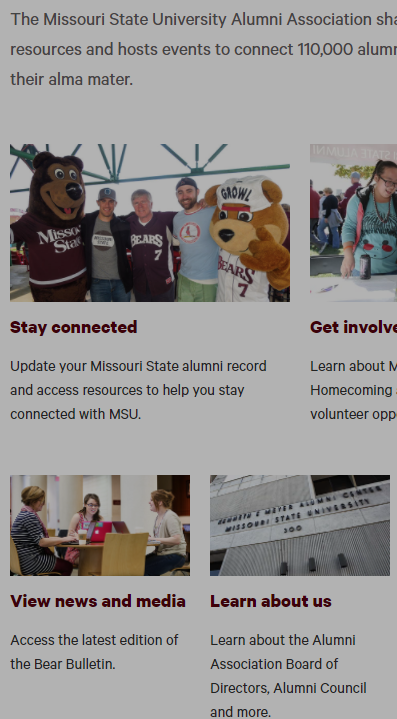
From old to new – blog

Old magazine format on desktop.
New blog format for featured magazine stories on desktop.
Old magazine format on mobile.
New blog format for featured magazine stories on mobile.

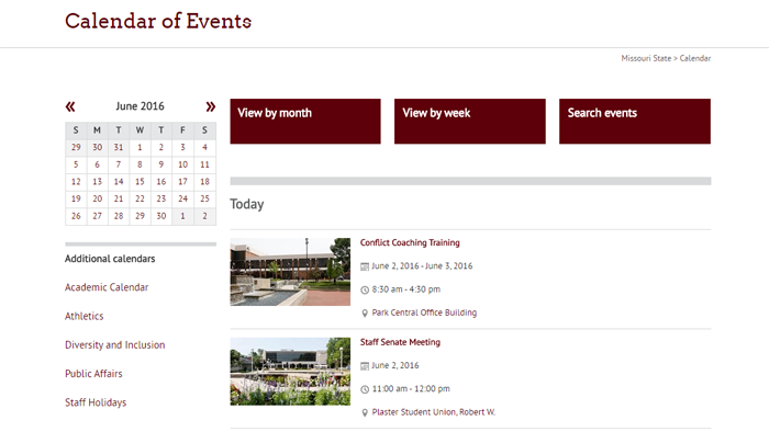
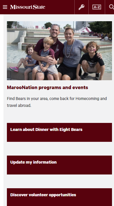
Phase 2 – New mobile friendly website

Next step, updating our website to streamline information about events, programs and ways alumni can volunteer. Warning, don’t go into a website redesign before a major event. I planned to finish the redesign before Homecoming, but didn’t take into account all the updates to the Homecoming website.

Again, we went back to our goals and consulted the Alumni Association Board and Council. Since mobile stacks information into one column, we created a hierarchy for the content and used clear calls to act buttons on our Missouri State University Alumni Association website.

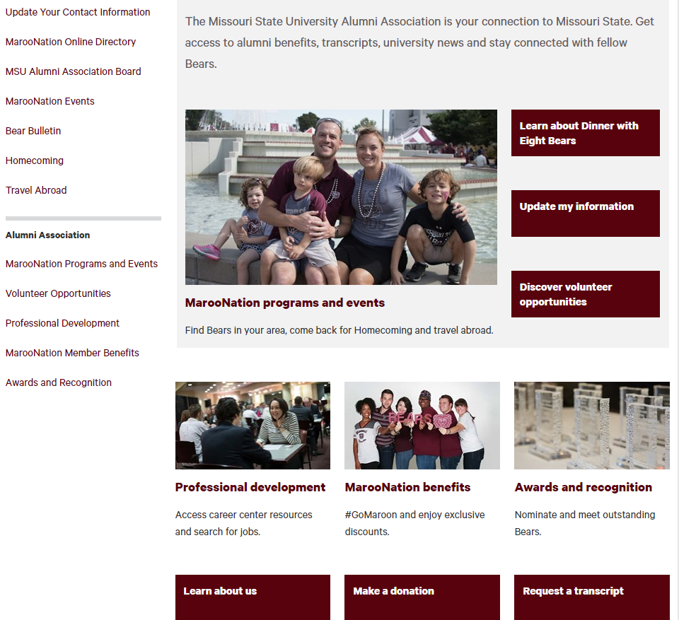
A mobile-friendly site

old alumni site
Old outdated alumni desktop site.
new alumni site
Newly updated and organized desktop site.
old not mobile friendly alumni site
Old and not mobile friendly website.
new mobile friendly alumni site
New and very mobile friendly website.

Phase 3 – New e-newsletter

Again, the data showed us nearly 50% of the audience accesses our email from a mobile device.  We stuck with one column, used more full-width photos, added calls to act buttons and reduced the text.

An email you want to open

Old desktop version of the Bear Bulletin e-news letter.
New desktop version of the Bear Bulletin e-news letter.
Old mobile version of the Bear Bulletin e-news letter.
New mobile friendly version of the Bear Bulletin e-news letter.

What we learned

  • Timeline for completion
    • Keep in mind vacations
    • Summer was great for us
  • Website
    • Plan ahead for any major content editing on your site
      • Ex: Homecoming is our biggest event and we were in redesign – not so good
    • Build sitemap
      • Before you start rearranging look at site navigation first
      • Then layout your pages
    • Review links on your site and pointing at you
  • Check mobile

You can download the full presentation for reference.

Filed Under: brand, Mobile, Redesign Tagged With: Blogs, digital communication, mobile friendly, Redesign, web and new media, websites

Redesigned physical therapy website: Identity and student success

April 10, 2017 by Kai Raymer

The new homepage of the physical therapy department website.

The redesigned physical therapy website recently launched as part of the academic website project. It is the latest academic website to receive a full redesign for the mobile-friendly template, a process that includes the creation of new content, design and multimedia elements.

Visual improvement

The redesigned homepage features distinct headers, brevity and a centerpiece photo showcasing a department student in action. Fresh photos give an identity to physical therapy students and faculty.

PT student in action.
A physical therapy student demonstrates techniques learned within the program.

Links on the left side of the page were also prioritized. Visitors are now one click away from high-interest department information such as curriculum and scholarships and financial aid.

Student achievements

Since 2009, the physical therapy department has held an ultimate pass rate of 100 percent. This information is highlighted in a call to action block on the home page, which links to year-by-year graduation rates – a vital recruiting tool for the department.

PT exam pass rates.
Exam pass rates a focal point for the physical therapy department.

Experience and opportunities

What, and where, will you be learning in the physical therapy department? Find out by visiting the Experience and Opportunities page, which explains your potential full-scale educational experience and the amenities of McQueary Family Health Sciences Hall.

Site credits

  • Project lead and content: Lucie Amberg, new media specialist, office of web and new media
  • Design: Abby Isackson
  • Photography: Bob Linder
  • Videography: Carter Williams
  • Editor: Nicki Donnelson
  • Implementation: Alyson Jones and Louis Freeman, with oversight from Brian Heaton

Filed Under: Academic websites, Mobile, News, Redesign, Web Press, Web redesign 2015, web strategy and development, WordPress blogs Tagged With: academic website, academic website project, mobile, mobile friendly, mobile redesign, physical therapy, Redesign

Redesigned physician assistant studies website: Academic excellence + work-life balance

October 3, 2016 by Lucie Amberg

Homepage of the physician assistant studies website

The redesigned physician assistant studies website recently launched as part of the Academic Website Project. It is the seventh academic website to receive a full redesign for the mobile-friendly website template, a process that includes the creation of new content, design and multimedia elements.

Homepage of the physician assistant studies website

Clarifying and communicating unique benefits

Early in the redesign process, we worked with the department to identify the following recruitment messages:

  • Physician assistants play a vital role in health care while also maintaining a positive work-life balance.
  • Missouri State’s physician assistant studies program allows students to finish in just 24 months — faster than many other PA programs.
  • Graduates of this program have a history of success on the physician assistant certification exam.

Emphasizing key recruitment messages

Photography throughout the site features physician assistants in action and students learning through hands-on experiences. The careers and outcomes page emphasizes the positive work-life balance associated with the profession.

The program’s efficiency, which gives it a strong recruitment advantage over programs that take longer to complete, is spotlighted on both the departmental homepage and the physician assistant program page. These pages consistently reinforce the message, “You will finish our program in just 24 months.”

The website highlights graduates’ success on the certification exam, which is required for anyone wishing to practice as a physician assistant. These pass rates have a permanent home on the exam pass rates page.

Site credits

  • Project lead and content: Lucie Amberg, new media specialist in the office of Web and new media
  • Design: Abby Isackson, graphic designer in the office of publications
  • Photography: Kevin White, senior photographer in the office of publications
  • Editor: Kevin Agee, new media specialist in the offices of communications and Web and new media
  • Implementation: Brian Heaton, content management programmer in the office of Web and new media, with Lucie Amberg and Sara Clark, director of the office of Web and new media, and student coder Louis Freeman

Filed Under: Academic websites, Mobile, Web redesign 2015 Tagged With: academic website, mobile, mobile friendly, recruitment, Redesign

Mobile-friendly academic website conversions: Spring semester progress

July 23, 2016 by Lucie Amberg

Campus scene with many students on mobile phones

Campus scene with many students on mobile phones
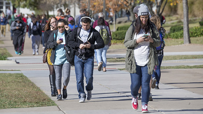
Mobile usage is growing exponentially — particularly among our largest demographics of prospective students, Millennials and Gen Z.

Last year, Google experienced two mobile milestones:

  • The mobile tipping point, in which the number of mobile searches in the U.S. surpassed searches on PCs
  • Mobilegeddon, a change to the Google search algorithm that benefits mobile-friendly websites over their non-mobile-friendly counterparts

Academic websites converting to mobile

In response to the growing need to reach our audience on mobile devices, we began the process of converting all academic department websites to a mobile-friendly format in 2015.

The conversion process is not a complete redesign. Instead, it converts each site to the mobile template and reorganizes existing content for consumption on mobile devices.

Like the academic website redesigns, conversions are funded by the provost’s office and processed on a college-by-college rotation according to the deans’ prioritization.

Websites that are converted to the mobile-friendly template will later undergo redesign, during which new content, multimedia elements and design elements will be created. This two-step process allows our office to optimize all academic websites for mobile consumption as quickly as possible.

Progress in the first half of 2016

During the first six months of this year, we published the following mobile-friendly website conversions:

  • Master of Natural and Applied Science
  • Nursing
  • Finance and General Business
  • Social Work
  • Counseling, Leadership and Special Education
  • Political Science
  • Modern and Classical Languages
  • Physics, Astronomy and Materials Science
  • Technology and Construction Management
  • Chemistry

Progress anticipated for the second half of 2016

An additional 14 academic websites are either currently in conversion or scheduled to begin the process before the start of the fall semester. We expect all of these conversions to be published during the first half of the fall semester.

Filed Under: Academic websites, Mobile, web strategy and development Tagged With: academic websites, mobile, mobile friendly, recruitment

Calendar is now mobile friendly

June 2, 2016 by

2016 Missouri State University Calendar Website

This week, we rolled out an all new version of the Calendar website. This was both a major brush-up of the user interface and a much-needed overhaul of the underlying technical infrastructure of the site.

Missouri State University Calendar Website

The biggest change is that the calendar site is now in our new mobile-responsive templates. We’ve been hard at work converting our web presence to the mobile friendly template, and getting a core site like the calendar is a big step forward in that effort.

We’ve thrown in some features as well. Events can now have a photo or YouTube video embedded in them, with default photos for most campus locations.

Searching and filtering events should be easier as well. We’ve updated the set of predefined keywords to a descriptive list of event categories that you can easily use on the agenda, week, and month views. Similar filters are available for audience, sponsor, and event location. Under the hood, the HTML markup behind every event’s details page has been updated to embrace a widely used standard to make it friendlier to search engines. This will be especially helpful for the coming updates to our search site.

We’ve also laid the technical groundwork for future updates to the site, including featured events. Stay tuned for further updates!

This project has been years in development, and we’re extremely glad to finally get it out to share with the campus.

Filed Under: Mobile, Redesign, Technical, Web redesign 2015, web strategy and development

Next Page »

Subscribe

Enter your email address to subscribe to this blog and receive notifications of new posts by email.

Follow @MSUWeb

My Tweets

Calendar

  • Complete Calendar

Categories

  • Accessibility
  • brand
  • email marketing
  • Mobile
  • News
  • Omni CMS
  • Redesign
    • Academic websites
    • Web redesign 2015
  • Social media
    • Social media kit
  • template
    • updates
  • Training
  • Video
  • Web Press
  • web strategy and development
    • Technical
  • Web Support
  • WordPress blogs

Meta

  • Log in
  • Entries feed
  • Comments feed
  • WordPress.org

Connect with web strategy and development

  • Twitter

Make your Missouri statementMake your Missouri statement
  • Last Modified: June 2, 2016
  • Accessibility
  • Disclaimer
  • Disclosures
  • EO/AA/M/F/Veterans/Disability/Sexual Orientation/Gender Identity
  • © 2013 Board of Governors, Missouri State University
  • Contact Information
 

Loading Comments...