
Missouri State University is transforming its homepage and other websites into mobile-friendly templates, and we need your help.
 Your audience is mobile
Mobile websites are key for recruitment. According to the Noel-Levitz 2015 E-Expectations report, 71% of high school juniors have viewed a college site on a mobile device, and they rate the college website as the most influential resource when researching colleges.
Second, Google recently experienced two mobile milestones:
- The mobile tipping point, in which the number of mobile searches in the U.S. surpassed searches on PCs
- Mobilegeddon, a change to the Google search algorithm that benefits mobile-friendly websites over their non-mobile-friendly counterparts
 How to get a mobile-friendly website
If you have a Web Press site, your path to a mobile-friendly website includes three steps:
- Content review and planning
The Web Help Desk will provide you a content inventory and site map, so you can review your content and make plans on how to adopt the best practices for mobile websites. - Conversion
The Web Help Desk will convert your website to the mobile templates, then you can implement your plans from step one. - Publication
Once everything is converted and optimized, the Web Help Desk will publish your website live.
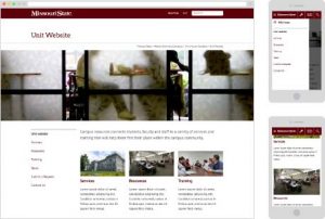
Upgrade to Mobile-Friendly Templates
Please know that we’ll be processing requests on a first-come, first-serve basis. We will do our best to work through the queue as quickly as possible.
Exceptions to this process
- Academic websites are already being converted to mobile templates as part of the Academic Website Project. Learn more about the academic website conversion.
- Editors of other websites outside of Web Press can attend a weekly open lab session to get assistance with the mobile-friendly template.