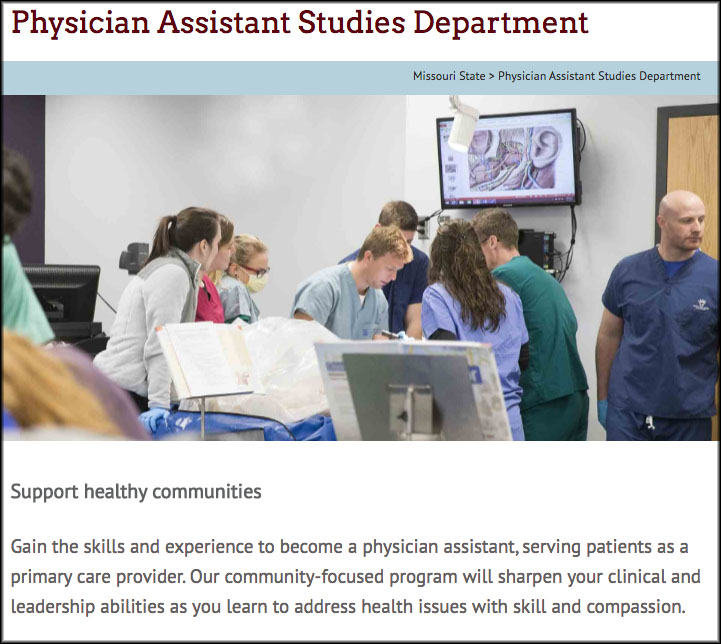
The redesigned physician assistant studies website recently launched as part of the Academic Website Project. It is the seventh academic website to receive a full redesign for the mobile-friendly website template, a process that includes the creation of new content, design and multimedia elements.

Clarifying and communicating unique benefits
Early in the redesign process, we worked with the department to identify the following recruitment messages:
- Physician assistants play a vital role in health care while also maintaining a positive work-life balance.
- Missouri State’s physician assistant studies program allows students to finish in just 24 months — faster than many other PA programs.
- Graduates of this program have a history of success on the physician assistant certification exam.
Emphasizing key recruitment messages
Photography throughout the site features physician assistants in action and students learning through hands-on experiences. The careers and outcomes page emphasizes the positive work-life balance associated with the profession.
The program’s efficiency, which gives it a strong recruitment advantage over programs that take longer to complete, is spotlighted on both the departmental homepage and the physician assistant program page. These pages consistently reinforce the message, “You will finish our program in just 24 months.”
The website highlights graduates’ success on the certification exam, which is required for anyone wishing to practice as a physician assistant. These pass rates have a permanent home on the exam pass rates page.
Site credits
- Project lead and content: Lucie Amberg, new media specialist in the office of Web and new media
- Design: Abby Isackson, graphic designer in the office of publications
- Photography: Kevin White, senior photographer in the office of publications
- Editor: Kevin Agee, new media specialist in the offices of communications and Web and new media
- Implementation: Brian Heaton, content management programmer in the office of Web and new media, with Lucie Amberg and Sara Clark, director of the office of Web and new media, and student coder Louis Freeman

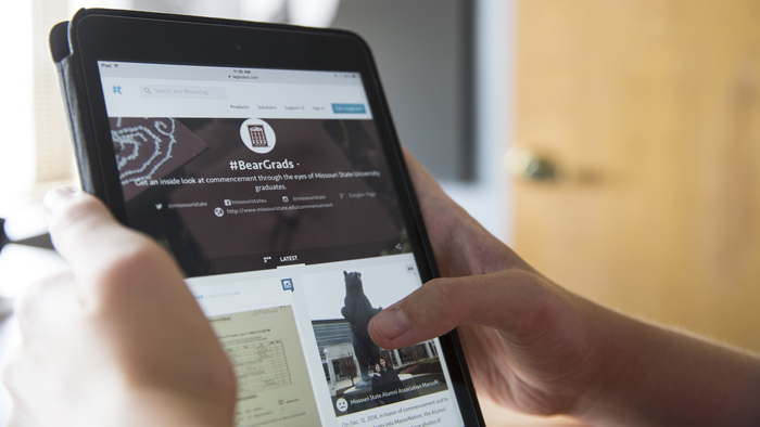
 Mobile usage is growing exponentially — particularly among our largest demographics of prospective students,
 Mobile usage is growing exponentially — particularly among our largest demographics of prospective students,
 Your audience is mobile
 How to get a mobile-friendly website