Missouri State University

Skip to content Skip to navigation
a b c d e f g h i j k l m n o p q r s t u v w x y z

Accessibility Updates

  • Accessibility Resources
  • Administrative Services Notifications

Recap: Making Your Statement in a Digital World – Sept. 29, 2017

October 3, 2017 by admin

We recently presented Making Your Statement in a Digital World, a comprehensive training session for Missouri State website, blog and social media managers.

Still have questions or need help?

We’re hosting two post-training open labs, to answer your questions and provide support. Please join us. No preregistration is required.

Key details

  • Dates: Friday, Oct. 27 and Friday, Nov. 10
  • Time: 2-4 p.m., both dates
  • Location: Meyer Library 106 Cheek Hall 100
  • About: Both sessions will be held in conjunction with the Web Help Desk open lab.

Access the presentations

The Sept. 29 training session was presented in four parts.

  • Readability
  • Blogging
  • Accessibility
  • Social media and visual platforms
    • Twitter
    • Facebook
    • Visual (YouTube, Instagram, aggregators, Snapchat)

wideshot of people walking on campus

Key takeaways

Readability

  • Use concise text and a scannable layout to make your content more readable. Put the most important information at the top.
  • Always ask, “how does this look on mobile?” Current and future students are researching your department/program on their phones.
  • Write less, people will read more. People will read more of a 300-word article than they will a 600-word article.
  • No one wants to put extra effort into reading. Seventy percent of people read at an intermediate (middle school) level. Newspapers aim for a 7th grade reading level.
  • Headings, bulleted lists and visual elements. Use them.
  • The YoastSEO plugin for WordPress is a great tool for improving your writing.
  • Improving your content readability has many benefits, including audience reach and audience action.

Blogging

  • Does your blog tell a story? Who is speaking in your story and how are you conveying that meaning? It’s important to start in the action and develop some sort of conflict that is resolved.
  • Be sure you are defining your audience; alumni, faculty, staff, and/or students?
  • Utilize the formatting strategies from readability while adding photography and pull quotes.
  • Update your blog with engaging stories at least once a month, if not more.

Students taking photo with Boomer

Accessibility

  • Accessibility means people with disabilities can use and navigate your website.
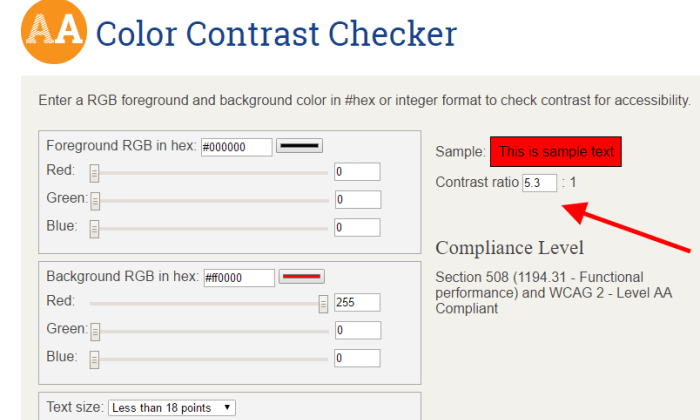
  • There are federal guidelines for accessibility. MSU, which receives federal funding, falls under WCAG 2.0 Level AA.
  • Think of your website as a public space (i.e. a courthouse or city hall). Make accommodations for all.
  • Accessibility overlaps with readability and best practices for websites. Having an accessible website means your website is better overall.
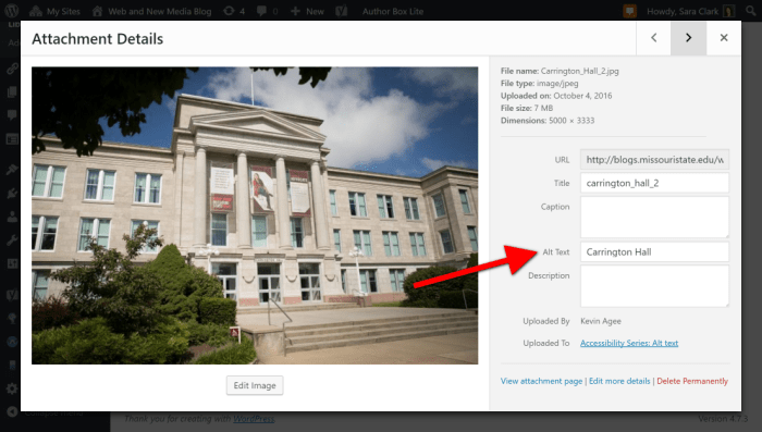
  • Alt text, headings and descriptive links are crucial for accessibility. Our Accessibility blog series also covers these topics, and more.

Social media and visual platforms

  • Share human – don’t be afraid to act like a human and interact with your audience one-on-one.
  • Set up a Facebook business account where people can find your contact information. Be prepared to respond to their questions.
  • Think visual – when on location for an event share raw photos, but when promoting the event utilize photo services to help boost your presence.
  • Video is king across all platforms. Be sure to add captioning for accessibility and to increase views.
  • Measure your success based off the goals your team sets: more followers, increased engagement, more views, etc. Keep a log of your analytics so you can compare data from previous years.

Students in computer lab

Filed Under: Uncategorized Tagged With: Accessibility, aggregators, blog, blogging, Blogs, content, facebook, instagram, News, presentations, readability, snapchat, Social Media, Training, Twitter, Web, Web Press, Web Strategy and Development, WordPress Blogs, YouTube

Accessibility series: descriptive links

April 20, 2017 by admin

Welcome to our series of posts entitled: how to make your website accessible! So far we have discussed the ethical and legal reasoning behind accessibility, how to write alternative text, and how to check color contrast.

In today’s post we discuss writing descriptive links. When you visit a website, do you read every word? Generally readers scan sites for what sticks out to them. Which of these following links makes you want to keep reading?

Click here to learn about Boomer

or:

We’ve just uncovered Boomer’s birth story

Descriptive links entice the reader to learn more. However, if you write “learn more” or “click here” for each link, readers will grow bored and stop following the links. Screen readers translate information into synthesized speech. These screen readers, like people, “jump” from link to link to read information in a logical order.

Tips for accessibility

  • Write descriptive links with important information first.
  • There is no length limit, though you should avoid paragraph-long links.
  • Avoid using URLs as links when the URL is a collection of letters and characters.

How to add links

If you are using WordPress, refer to the above Boomer example. Attach link by highlighting the phrase:

Screenshot of example of descriptive links

Click on the chain icon and type the address. The link will appear in blue.

If you are working with Web Press, this video from the Missouri State Web Help Desk shows how to link to webpages.

Filed Under: Uncategorized Tagged With: Accessibility, descriptive links, how-to, Web Press, Web Strategy and Development, WordPress, WordPress Blogs

Accessibility series: color contrast

April 7, 2017 by admin

Welcome to our series of posts entitled: how to make your website accessible! So far we have discussed the ethical and legal reasoning for why accessibility is important, and how to write alternative text.

Today we focus on color contrast.

Have you tried reading black letters on a red background? What about red letters on a maroon background? You might want to add some color to your website, but how do you ensure your site is still readable?  The color contrast between the text and the background affects readability.

The contrast should be 4.5:1. This is the comparison between relative luminance of the first number compared with the second number. The good news it is easy to check. This color contrast site shows foreground and background color.

How to test

For foreground, click on the box for a color wheel and find the color of the font you are using. Click on the appropriate color to select it. It will show a small square in the color you picked.

Then, for background, repeat this step.  It will also show a small square in the color you picked. You will see a color contrast ratio that automatically adjusts based on your color wheel selections. Make sure the ratio is 4.5:1 or greater.

Let’s return to the initial example. To pick colors, you will want to use the branding recommendations to ensure a consistent appearance.

First, let’s check black text against the Brick City Red background:

color contrast checker of black letters on red background

Perfect! The ratio is greater than 4.5:1, so this combination passes accessibility standards.

A word of warning: Some color combinations look like they “should” be readable, but are they? For example, take the Brick City Red text on Missouri State Maroon background. Let’s check.

color contrast checker of red type letters maroon background

Nope! The color contrast ratio of 2.7:1 does not meet the accessibility standard of at least 4.5:1.

Filed Under: Uncategorized Tagged With: Accessibility, color contrast, Web Press, Web Strategy and Development, WordPress, WordPress Blogs

Accessibility series: alt text

April 3, 2017 by admin

Welcome to our series of posts entitled: how to make your website accessible! In the first post we discussed the ethical and legal reasoning for why accessibility is important.

Today we focus on adding alternative text to images.

Tips for success

It’s a good idea to add images to posts because it drives readers to your site. But how do we make the image work for everyone?

Imagine the pre-smart phone days. You’ve found an image from your days in Brownie Scouts and want to show your best friend. But she lives six hours away. You could make a copy of the photograph and mail it to her, but you can’t wait! So, you call her up on your landline and tell her about the photo. Similarly, alt text is like describing an image so that the website visitor can understand its meaning.

How much should you say? Here are specific ideas to consider while writing alternative text. Don’t begin the text with the words “an image” or “a photo.” Don’t repeat the caption because it is redundant. Do briefly describe the image.

When blogging

If you post to a Missouri State blog, you use the blogging platform WordPress.  This is how you add alt text within your Missouri State blog.

Example of WordPress screen for al text
Use the Alt Text field to when uploading or editing an image in WordPress.

When updating your website

Missouri State webpages are maintained on Web Press. To add images to your site, upload it or select the image in the Asset Manager. You will have the option to add the caption. This is used as the alt text in Web Press.

Web Press screen showing alt text (caption)
Use the Edit Attributes link to add or change the alt text for an image.

How to know if you are successful?

To determine whether your site meets accessibility standards, enter the address into a web accessibility site like WAVE. Find the alt tag on images within the results. If it is green the alternative text is sufficient. If it is yellow it needs attention; it might be too long or too short. If it is red you need to add text.

Screenshot of students taking a photograph of themselves
After you enter your website address into WAVE, review the results for small red, yellow or green squares on each photo to check for acceptable alt text.

Filed Under: Uncategorized Tagged With: Accessibility, alt text, Web Press, Web Strategy and Development, WordPress Blogs

Categories

  • Access Technology Center
  • Diversity and inclusion
  • News
  • President's Council on Disability
  • Provost
  • Web Strategy and Development
  • web-strategy-and-development

Tags

a11ysummit Accessibility Ally alt text autism blackboard brand Campus Focus conference construction content COVID disability Diversity Initiatives document editing FCTL Featured gaad improvements marketing Microsoft Office Mind's Eye News Omni CMS Omni CMS training policy professional development Provost Communique readability Redesign Shattering the Silences Series Social Media Technical template Training Upcoming Events Web Press website accessibility websites Web Strategy and Development Web Support WordPress WordPress Blogs YouTube

Meta

  • Log in
  • Entries feed
  • Comments feed
  • WordPress.org
Make your Missouri statementMake your Missouri statement
  • Last Modified: April 3, 2017
  • Accessibility
  • Disclaimer
  • Disclosures
  • Equal Opportunity Employer and Institution
  • © 2025 Board of Governors, Missouri State University
  • Contact Information
  • Healthcare MRFs