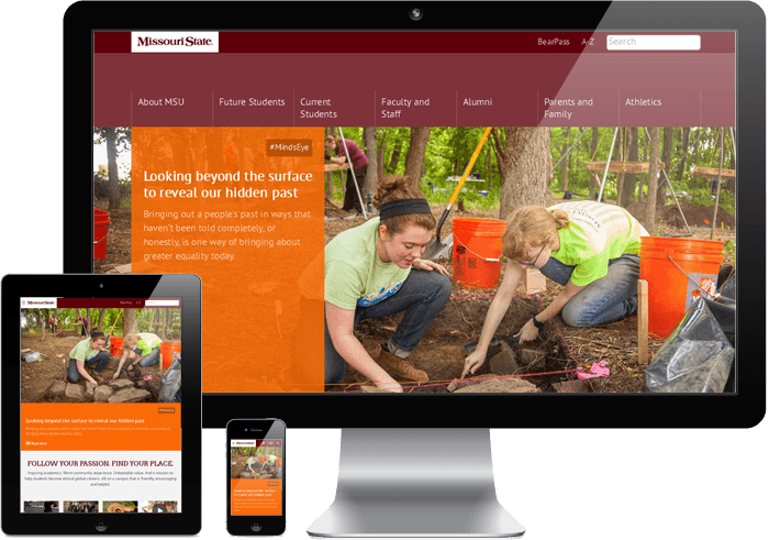
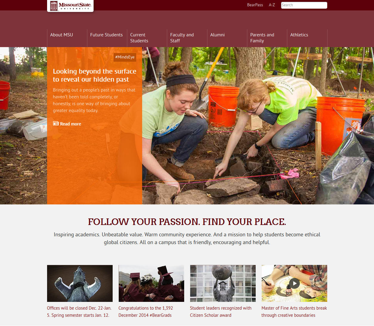
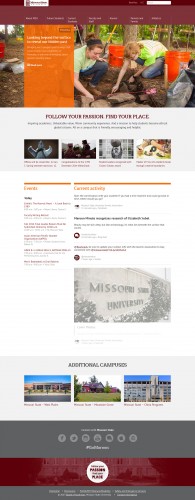
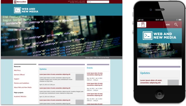
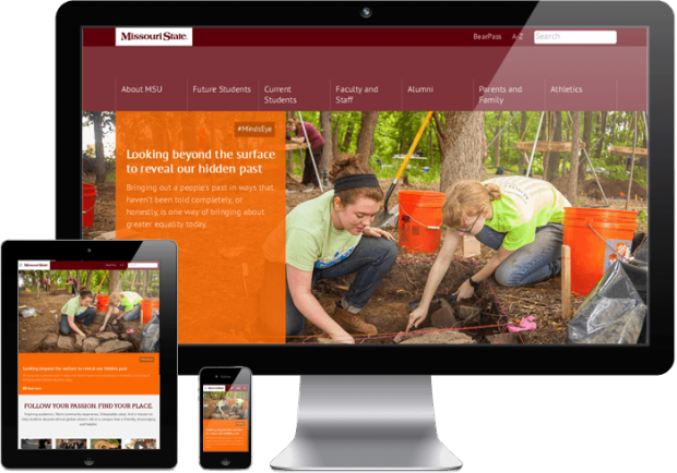
In response to the demand for websites that can be readily consumed via smartphones and tablets, the homepage for MissouriState.edu has transitioned to a mobile-adaptive format. In addition to serving mobile consumption, the new format provides a rich, multimedia experience that includes more photo and video and heightened social media integration.
We encourage you to try out the new homepage on your desktop computer, tablet and phone to see how it adapts to different screens.
Notable enhancements
- Athletics now has a presence in the top navigation of the website.
- The main feature area is more prominent, allowing us to spotlight very high-level content in a variety of ways – including photo and video. Color themes will coordinate with each feature’s theme, photography or selected media.
- All feature areas can now be rotated according to a fluid timeline, one that’s responsive to important Missouri State news and events.
- The social media activity stream continues to have prominent placement, providing users with real-time snapshots of the Missouri State community.
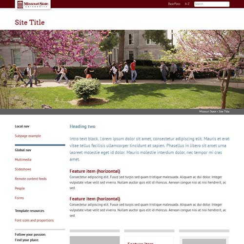
While the overall structure of the new homepage is established, incremental changes will continue to occur as we keep Missouri State’s Web presence in line with evolving tech trends and user expectations.
Feedback and questions
We invite your feedback. Please send us your thoughts.