Missouri State University has unveiled important updates to its branding guidelines, refining how the university looks, communicates and presents itself. This refinement of the current brand comes as the university begins a broader brand refresh, with a new brand set to be unveiled this fall.
From visual elements and editorial tone to the official color palette, these changes provide a cohesive framework that ensures every touchpoint reflects the university’s identity with clarity and consistency.
Highlights
Visuals
- The Mo State spirit logo is now downloadable from the brand website and it is limited to athletic and non-academic applications
- Stop the use of:
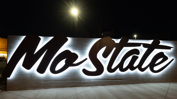
– All other spirit logos (M, MSU)
– The Mo State Helvetica and Make Your Missouri Statement logos
– Any images of bear paws or claws
– Other bear imagery from colleges, departments, offices, etc.
Editorial
- Naming of the university: First reference of the university’s name should be Missouri State University. Subsequent references may be Missouri State, Mo State, the university or the institution. The use of MSU is fine in print publications as a secondary or tertiary reference, especially with serious/academic topics. Mo State is two words, uppercase M and lowercase o. In headlines, Missouri State or Mo State is acceptable depending on context of the piece, but never MSU.
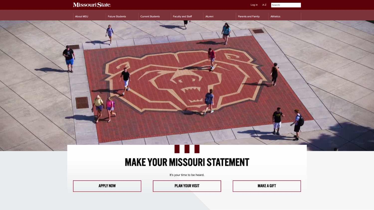
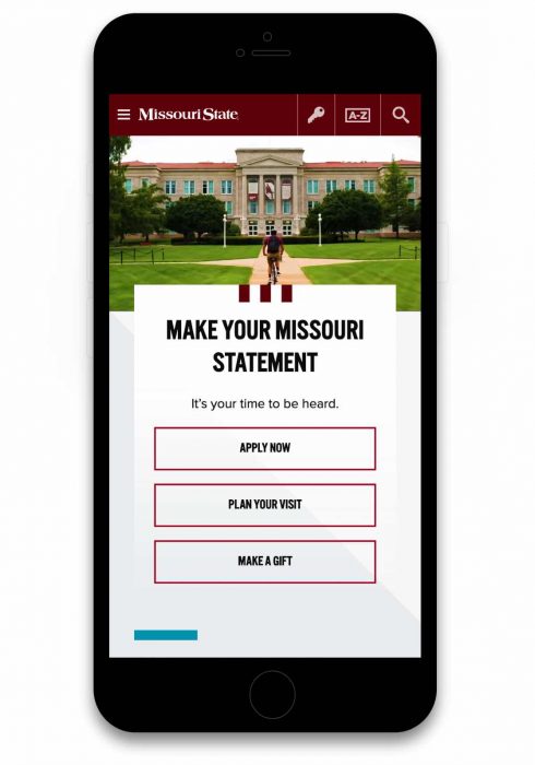
- Limit the use of “Make Your Missouri Statement” (until a new tagline is approved)
- Stop the use of “Bear Up”
Color palette
- Use secondary colors and tertiary neutrals sparingly (no more than 30%) and they should not be used as the primary color in environmental branding or for branding for any official university unit
- Stop the use of tertiary pop accents
For further details, refer to this brand refinement document and the brand website.
For any questions or issues, please contact Veronica Adinegara, creative services director.