In this series of posts we call attention to effective uses of our branding strategy. We offer these brief points to inspire you in your own branding efforts.
Who caught our attention
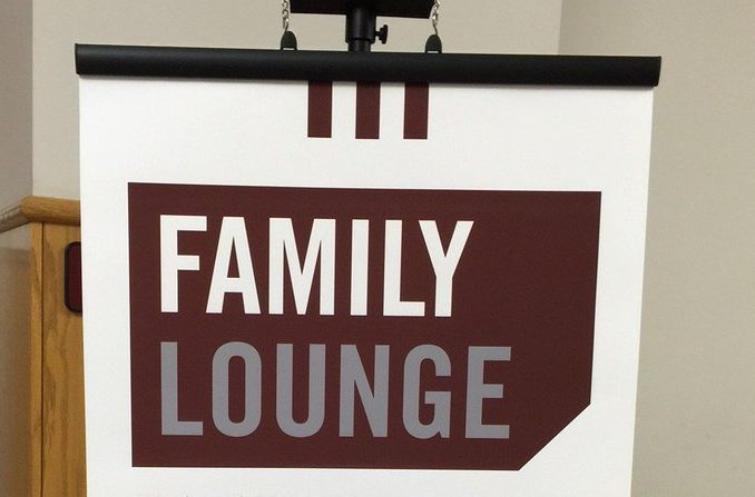
The Missouri State Family Association‘s welcome banner.
Great 1st day of @MSUsoar Session 11! On to Day 2 and the Family Lounge! Our guest is @brianna_duda! #BearUp pic.twitter.com/mTMxedloAQ
— Missouri State University Family Programs (@BearsFamilies) July 14, 2016
Why it captures the brand
The Family Association incorporates recommended branding elements for a consistent message.
Visual Identity
The Family Association uses several effective visual elements.
- It displays the banner with grounding bars. These capture the viewers eye because they offer a “grounding” point for compositional grids containing three maroon bars.
- It uses deconstructed frames, which are used to “bend” the enclosure of the frame. This provides a dynamic image that invites the viewer to connect with the message. Because of this the phrase “family lounge” now inspires images of opening a book, turning a page, receiving a ticket, or possessing a pass. It invokes closeness for viewers to connect with the school, and optimism for the student’s future at the university.
- It uses a sans serif font called Brandon Grotesque, which is recommended for external communication with different audiences. The text font also follows recommendations that enable both scripts to complement each other.
- It includes all three of our primary branding colors: maroon, white, and black. It uses Carrington as a neutral font to offset the primary colors without getting lost against the white background.
How it meets the Association’s goals
This cohesive use of brand elements helps the Association connect with its targeted audience of family members of incoming students.