In this series of posts we celebrate examples of creative and engaging branding in the university community. We highlight these to inspire you in your branding.
Who caught our attention
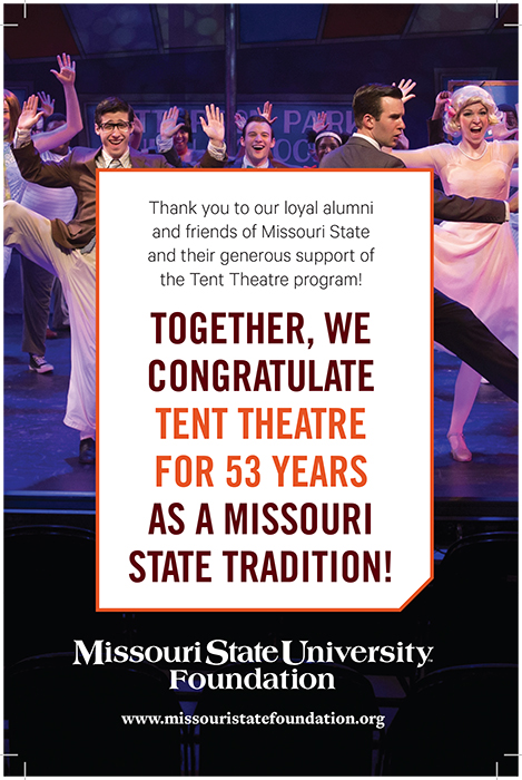
Missouri State University Foundation’s ad in the Tent Theatre brochure.
Why it captures the brand
The Foundation uses several effective visual elements to convey its message.
Visual identity
- The Foundation demonstrates effective use of environmental photography, which is used to communicate vitality of life on campus. This photo of students dancing draws viewers to the scene by helping them to imagine hearing the music and laughter on stage.
- It also uses statement photography, which demonstrates scenes of students actively learning. In this case, students showcase skills in acting and dancing. We also see examples of skills acquired in costume, makeup, stage production, lighting, choreography and directing. This combines for a well-rounded presentation of the Tent Theatre program and helps the viewer appreciate its impact on student performers and the audience.
- It uses deconstructed frames, another recommended element of the branding initiative. This helps convey motion and energy and brings to mind a ticket for an event. These elements combine to invite the viewer to join the scene.
- It uses the three recommended primary colors of maroon, black and white. They include the tertiary pop accent of “Tent Theatre orange” to make the wording stand out amidst a scene of celebration.
- It uses Trade Gothic and Calibre font to communicate a clear, modern message.
How it meets the Foundation’s goals
Using these brand elements helps the Foundation illustrate actors showing enthusiasm and gratitude in a performance, which conveys appreciation for financial support.